In 2021, I was really interested in centres of population, and I decided to calculate them for everything I could imagine. It turns out the results are pretty entertaining for almost any section of a national census. Are Fijians a more westerly ethnicity than Acadians? (Yes, they are!) Is there a mean centre of income? (Yes, it's a little west of the mean centre of population.)
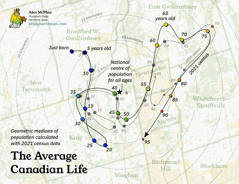
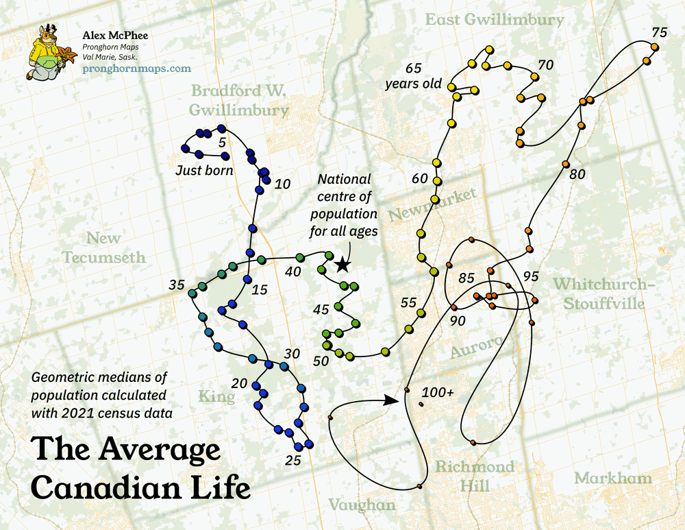
It's easy to calculate the dots, but when can we connect them? Out of all the census variables, there is one that forms a natural time series: human age. Thus was created The Average Canadian Life, one of my better-remembered random social media posts over the years. You may well have personally contributed to this squiggle:
In general, there are more babies in Alberta, more young professionals in Toronto, and more senior citizens in the Maritimes, so there is some hard logic to this wandering path. But even if it makes intuitive sense, can we be sure that this really means anything? Let's get into the top-level assumptions and the technical workflow that went into making this project.
In the middle of something
I hate to drop this kind of truth bomb but "centre of population" is a mathematically imprecise term. There is no such thing. Look, I'm not a math major either. (Wikipedia)
I recommend reading this very short and Canada-specific paper1, which explains everything concisely, provides useful instructions for creating your own algorithm at home, and includes the unbeatable sentence "The population counts were extracted from the 1976, 1981, and 1986 Geography Tape Files".
-
The median centre is the point that divides the set of points into two sets of equal halves, usually north-south and east-west. Tantalizingly, this is very computationally simple and can be calculated by anybody with a working knowledge of Microsoft Excel, so it appears in a lot of economics papers where it shouldn't. One big problem with this method is that the direction of north matters and you will get a different result if you rotate your dividing lines.
-
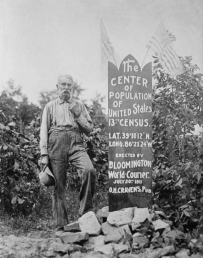
The mean centre is the balancing point, the centre of gravity. This is also computationally simple (the U.S. Census Bureau has calculated it for long enough that it is part of the original myth of western expansion), but it's difficult to do with QGIS alone and some basic ability in Python helps.
-
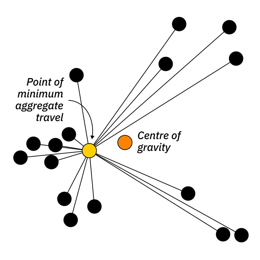
The geometric median centre is the point of minimum aggregate travel. Think of it as the ideal place to build a really big hotel. Mathematicians have proved that there is no truly simple way to calculate this one, but any modern computer won't think twice about iterating through hundreds of guesses.
Wait, the mean centre is different from the point of minimum aggregate travel? Yes! The centre of gravity is going to be disproportionately thrown off by the locations of the most distant people. Here's a visual demonstration I embellished from Wikimedia Commons:
You should definitely just go and read that five-page paper I linked, but in case the link died or something, it makes the following assessment:
Unfortunately, there is no ideal measure of the center of a population. The median center is insensitive to the distances of points from the center; the mean center puts undue weight on the distant points; and the point of minimum aggregate travel is insensitive to radial movements of the individual points. Of these shortcomings, the insensitivity to radial movement is the least severe, and the point of minimum aggregate travel is recommended as the best measure of the center of a population.
A bit of programming
Just ignore this section if you don't want to try doing any of this at home. This is a simple enough problem that anyone who made it through high school math should be able to tackle it. Let's assume that you're using the ubiquitous Python "pandas" library, and that you have a big spreadsheet of census information in the following format:
| Dissemination area | Latitude | Longitude | Census variable |
|---|---|---|---|
| 10010165 | 47.527088 | -52.776718 | 500 |
| 10010166 | 47.527346 | -52.775186 | 340 |
| 10010167 | 47.529744 | -52.772671 | 410 |
Calculating the mean centre is simple, so let's start with that. The only little hiccup here is that we're using spherical coordinates, and we need to remember that the actual length of 1 degree of longitude changes depending where on the ball we are.
import pandas as pd
import numpy as np

census_information = pd.read_csv(your_filename_here).set_index('Dissemination area')

def mean_centre(census_information, census_variable):

    df = census_information.loc[:, ('latitude','longitude', census_variable)]

    total = df[census_variable].sum()

    df['lat_sum'] = df['latitude'] * df[census_variable]

    latitude = df['lat_sum'].sum() / df[census_variable].sum()

    df['lon_sum'] = df[census_variable] * df['longitude'] * np.cos(np.pi*df['latitude']/180)

    df['lon_den'] = df[census_variable] * np.cos(np.pi*df['latitude']/180)

    longitude = df['lon_sum'].sum() / df['lon_den'].sum()

    output = pd.DataFrame([census_variable, latitude, longitude, total],
                    index=['Census Variable','Latitude','Longitude','Total population']).transpose()

    return output
I pride myself on being a desktop GIS user more than I am a programmer, but I have to admit that this is a really short and useful script that makes choosing a map projection irrelevant and replaces a lot of messing around with opaque plugins in QGIS.
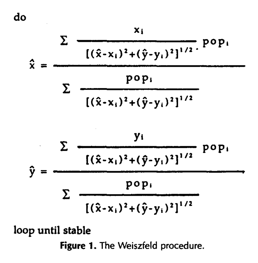
Now we're ready to take on the harder task of calculating the geometric median. Let's go back to that paper, which helpfully describes a simple algorithmic approach to this problem:
The Weiszfeld procedure begins with the selection of an arbitrary point as the initial seed location. The distances and directions from that seed to all other (possibly weighted) points are determined, and the trial point is displaced in the indicated direction. The procedure is then repeated until it stabilizes on a value, or some displacement threshold is reached.
You can pick apart my implementation if you like, but otherwise just trust me that it runs:
import pandas as pd
import numpy as np

census_information = pd.read_csv(your_filename_here).set_index('Dissemination area')

def travel_centre(census_information, census_variable, threshold):

    df = census_information.loc[:, ('latitude','longitude', census_variable)]

    total = df[census_variable].sum()

    # Convert spherical coordinates

    df['x'] = np.cos(np.pi*df['latitude']/180) * np.cos(np.pi*df['longitude']/180)
    df['y'] = np.sin(np.pi*df['latitude']/180)

    # Location of our initial guess. This is a random location in Lake Huron

    xh = -80
    yh = 45

    delta = 100

    # Repeat until very little progress is being made
    # I use 0.00001 as my default threshold value

    while delta > threshold:

        oxh = xh
        oyh = yh

        df['xn'] = ( df['x'] / ( (xh - df['x']) ** 2 + (yh - df['y']) ** 2 ) ** 0.5 ) * df[census_variable]
        df['yn'] = ( df['y'] / ( (xh - df['x']) ** 2 + (yh - df['y']) ** 2 ) ** 0.5 ) * df[census_variable]

        df['d'] = df[census_variable] / ( (xh - df['x']) ** 2 + (yh - df['y']) ** 2 ) ** 0.5

        xn = df['xn'].sum()
        yn = df['yn'].sum()

        d = df['d'].sum()

        xh = xn / d
        yh = yn / d

        delta = ( (oxh - xh) ** 2 + (oyh - yh) ** 2 ) ** 0.5

    # Now spit out the final results

    latitude = np.arcsin(yh) * 180 / np.pi
    longitude = - np.arccos(xh / np.cos(latitude * np.pi / 180)) * 180 / np.pi

    output = pd.DataFrame([census_variable, latitude, longitude, total],
                    index=['Census Variable','Latitude','Longitude','Population']).transpose()

    return output
Note: the Earth is not quite round, and if we were really anal we might want all of these distance calculations to account for the ellipsoid. This can be easily done with the GeoPandas Python library. I'm not going to bother here.
Wait, that's new. Why am I not being really anal? I just want to protect you, my beloved audience, from the horrific, sloppy reality of coding for real-world science. In practice, if you (sensibly) understand programming as a means to an end, then Python is all about downloading random libraries to solve complex tasks in single lines of code. What if it doesn't work right? That's the library maintainer's fault, and if you're not a software engineer you'll probably never get to the bottom of it. It is famously said that Python is always the second-best programming language to solve any task.
Being able to implement simple low-level procedures from old papers is a base skill that lets you solve more problems than any amount of proficiency in specialized high-level desktop software. For the time being, I think it's more fun, or at least more educational, to keep the math simple enough that it can all just be done right here in the script.
The wandering path
As soon as I first calculated The Average Canadian Life, I was struck by the seemingly intuitive explanations for every major bend in the line, but I wondered if it was really meaningful. It wouldn't be the first time that my brain had tried to interpret random nonsense.
Luckily, age is one of the most granular parts of the census, and each year gets reported individually. This means we can break open those 5-year population buckets to calculate a messier and more detailed version:
Success! As usual with dis-aggregated data, the result is more scattered. But we can see proof that all the years really do form an approximate sequence, with the same approximate form as the first map. This also tips us off that the data becomes nonsensical after 90 years, as the population numbers get very thin and the geometric median points start escaping in all kinds of wild directions.
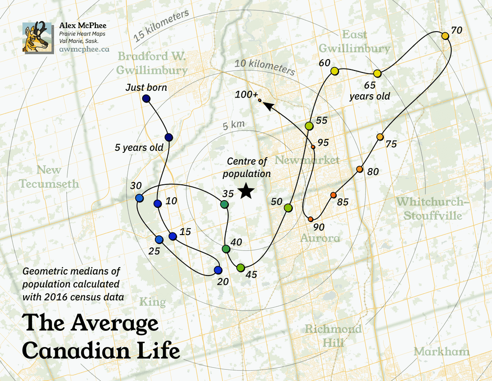
If we pull out the original version of this map, which I made in October 2021, we can also see the the general shape of the Average Life squiggle has remained very consistent between 2016 and 2021. This is another good sign that we're looking at something real.
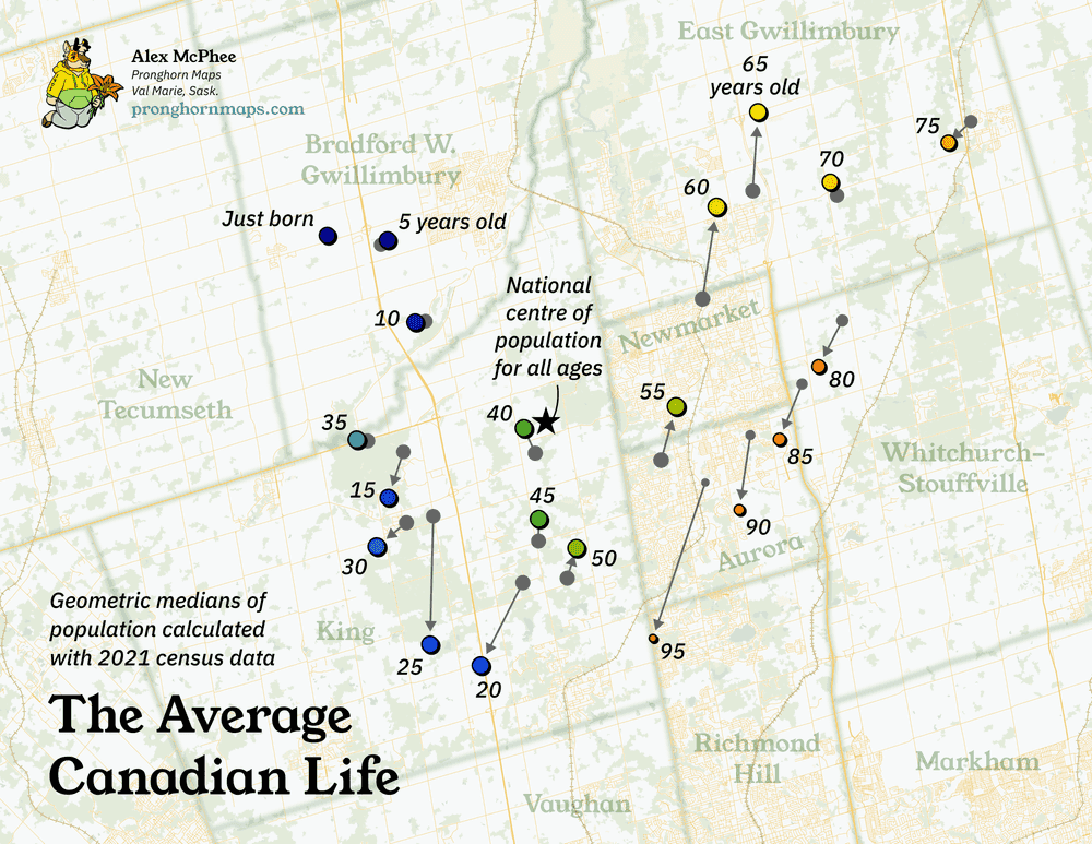
There is one more quick way of looking at this data. You might remember from the top of the page that the average 5-year-old in 2016 now lives in exactly the same spot as the average 10-year-old in 2021. So what if we just ignore the weird squiggle, and match every 2016 cohort to its 2021 equivalent, five years in the future?
Interesting again! It looks like some age groups are less mobile than others: kids barely move at all, but twenty-somethings head straight for the GTA. Then you become middle-aged and stop moving again, probably because you're busy raising all those children in Bradford West Gwillimbury.
On the far side of middle age, there's a little retirement age bump around 70-74, where you're out of the workforce but still living independently enough to stay at home. Beyond that narrow cohort, you're either actively retiring into the suburbs, or getting sent to a care facility back in the core.
Again, the data for the very elderly gets sparse and weird, so I've manually removed the final 100+ cohort as the result seems completely meaningless.
Return to centre
There are definitely more sophisticated ways to use census data to track human mobility against the human lifespan, but the unusual simplicity of The Average Canadian Life has reliably earned a lot of attention on social media. Just a testament to the weirdly compelling power of centres of population!
...even IF that's mathematically imprecise language, and there really is no such thing as a centre of population.
- Kumler & Goodchild. (1989). The Population Center of Canada— Just North of Toronto?!?↩
