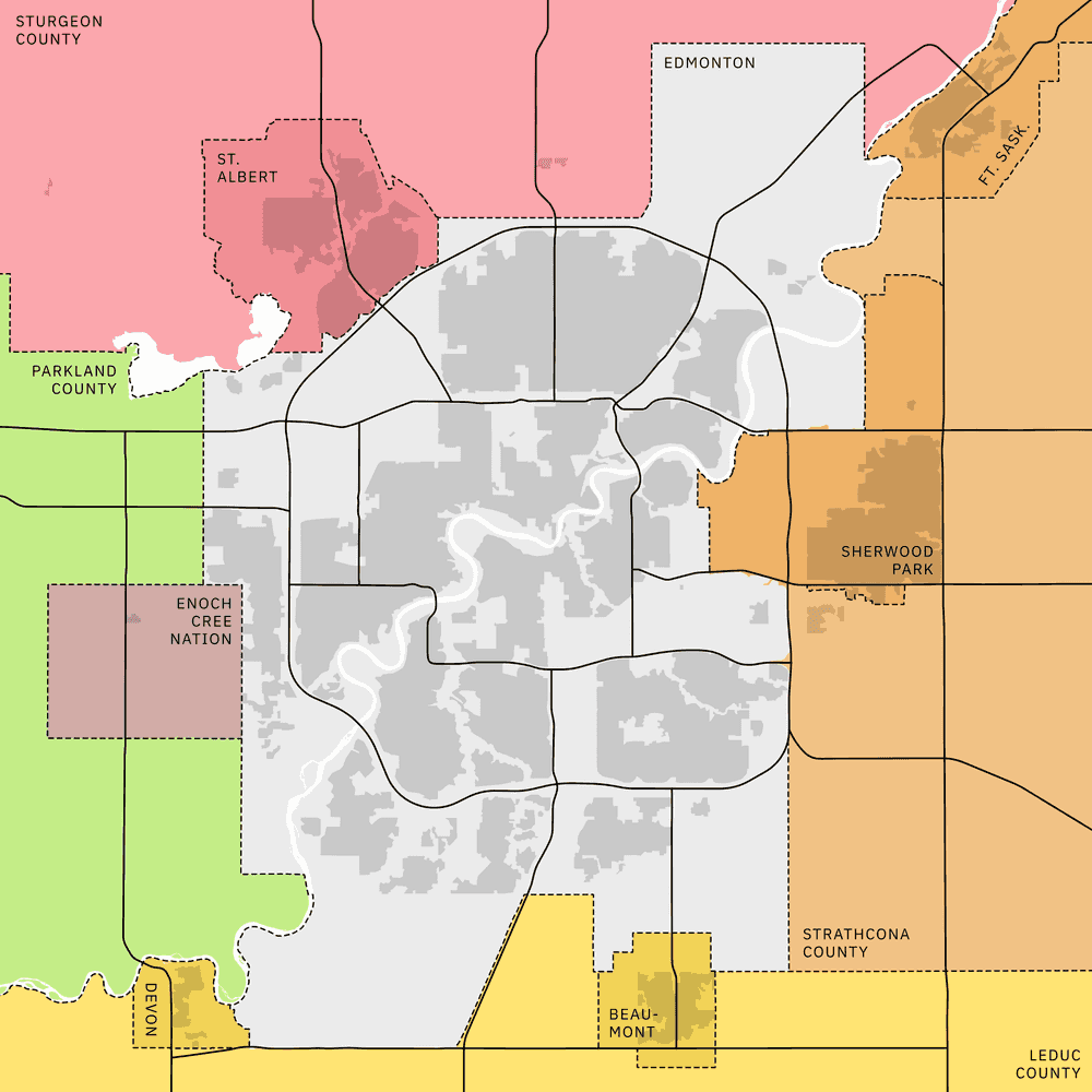
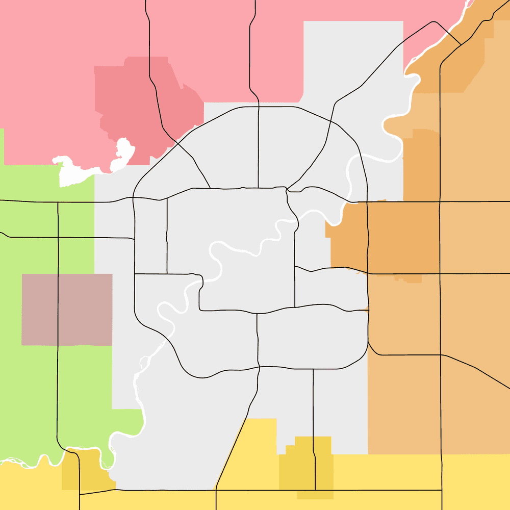
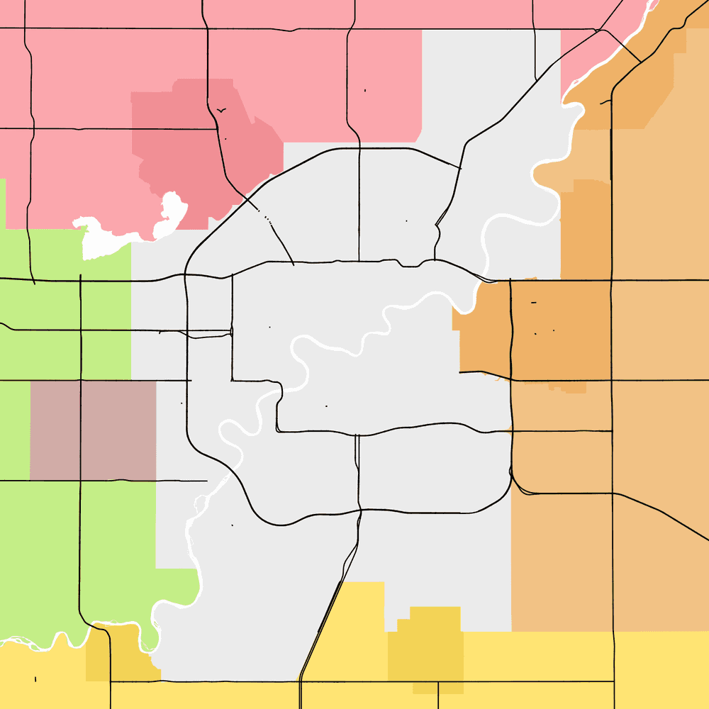
Here's a simple little map of Edmonton, Alberta. If you happen to be an Edmontonian, you might know something about the city's legal municipal boundary, and most people are generally aware that the North Saskatchewan River has a diagonal southwest-northeast course. But to actually find yourself on a map like this, you're probably going to look at the major roads in town.
Let's strip off all the other details: here's the comfortingly round shape of the Anthony Henday Drive, Canada's first complete ring road. The ring is punctured by the Yellowhead Highway, connecting Winnipeg to the Pacific Ocean. In the south, Alberta Highway 2 leads straight to Calgary, that other city (which obnoxiously remains slightly larger than Edmonton).
All around the world, if a city is dominated by things moving on rubber tires, its residents are probably going to use major roads as landmarks. This is very important if you want to publish maps that people can easily understand!
So this is normal cartography stuff so far, right? Roads are built by governments, governments create digital files, and cartographers load digital files into their favourite GIS software. I probably just downloaded these road lines from some official source.
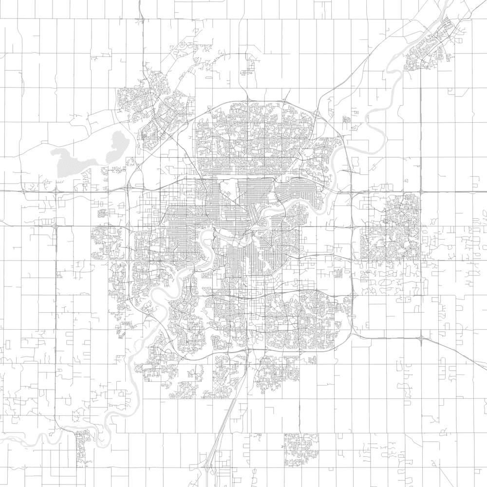
WRONG - this is yet another part of my job that gets obnoxiously difficult FAST. You can follow along at home by downloading the 2024 National Road Network (289MB) - most provinces also maintain their own in-house alternatives to this file. Let's slap it into our canvas:
Pet peeve: you can buy an endless supply of SEO-optimized map posters on Etsy showing "every road" in [common geographic search term]. Every road!! This must look really impressive to laypeople, but the fact is, all the real work is being done by your tax dollars. It takes almost no technical GIS skill to download the NRNF, which is free, and churn out endless thousands of machine-generated pdfs. Of course, if you're already reading this blog post, you're probably not the type of person I need to lecture about the enshittification of my industry.
This level of detail is pretty, but it's not useful. These intricate road patterns are going to visually overwhelm any project we drop them into. How do we pick out just the important ones?
In GIS, every dataset has a spatial component and a database component, i.e., a spreadsheet attached to the lines we see on the map. Let's dig into that spreadsheet and see whether the government included some kind of internal hierarchy of importance.
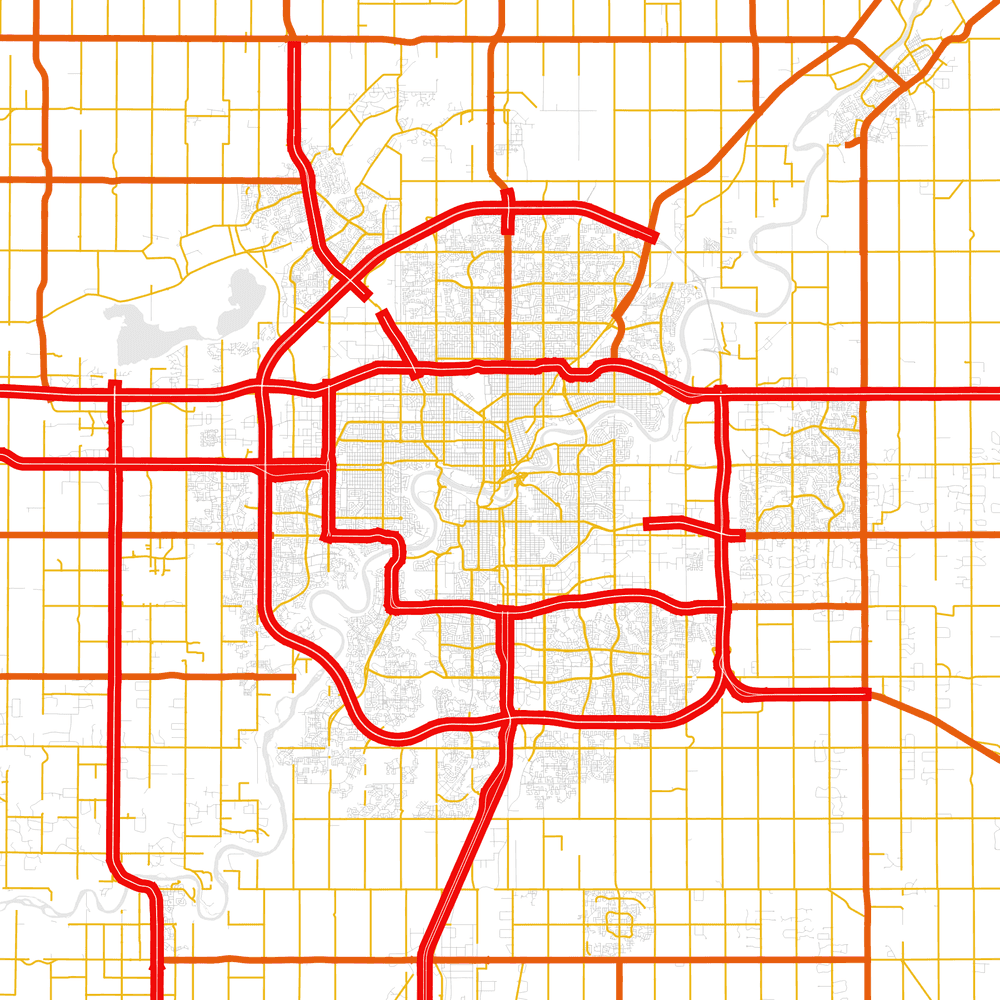
We're in luck! Statistics Canada has included a spreadsheet field called CLASS. In Edmonton, it looks like CLASSes of 10, 21, and 22 denote major roads: the overwhelming majority of regular city streets are CLASS 23.
Are you the type of person to ignore official metadata? I sure am. But this is a tutorial, so I have to pretend to be more diligent than I really am. Instead of wasting time puzzling over what this CLASS business is all about, we can go straight to the Statistics Canada source. Behold:
| Class | Textual description |
|---|---|
| 10 | Highway |
| 11 | Expressway |
| 12 | Primary highway |
| 13 | Secondary highway |
| 20 | Road |
| 21 | Arterial |
| 22 | Collector |
| 23 | Local |
Hmm, it looks like the government is bad at its job: Edmonton definitely has primary and secondary highways, but this dataset doesn't use CLASSes 12 or 13 for any road in Alberta. And what's up with the northeastern portion of the Henday being encoded as 23? That's definitely a freeway, and it's been open for years. We're running into a pretty significant data quality issue here.
Let's just ignore these data quality issues for now and do the fastest thing available: filter the dataset for all CLASSes below 22.
Ugh, random freckles too? Yes, it turns out the NRNF has a couple random specks of 20 (Road, unclassified) mixed into the dataset. This kind of badly cleaned data is unfortunately a very common sight in my experience!
In cartography, you're never far away from having to do a bunch of manual labour. Let's just skip the really boring stuff, I took some time to perform my own filtering of the NRNF dataset. Wouldn't it be nice if this could be computerized...
Freeways have one very obnoxious trait: they're divided. The two directions of traffic are physically separated, with grass between them. That means most major roads in North America, when they finally get entered into an official GIS dataset, are represented by two (or more!) lines in space. Behold the random variety of median widths that have been constructed by Central Alberta's finest traffic engineers! This quality is obscured by distance, but not erased - the separation of Highway 2 (heading south to Leduc, then Calgary) is clearly visible at this scale.
This level of detail is great for Google Maps, but when you're just using roads as a simple reference for a thematic mapping project, it looks really untidy to have a bit of quaver on all of your line weights. Even if you're not an obsessive artist, it's never good practice to use a dataset that's too accurate and detailed for the task at hand. Let's FIX it!!
Um... although ArcGIS and QGIS are generally very comparable in functionality, sometimes the open-source alternative has less features than its corporate competitor. Here I have to admit that ArcGIS comes equipped with a tool right out of the box for this exact problem: Merge Divided Roads.
But do I LOOK like I have a hundred bucks for a software license?? Well... maybe, but I can think of better recipients for it than the ESRI corporation. Let's use a sequence of processing tools that ARE available in QGIS.
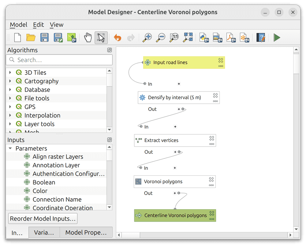
Whenever I have to run a sequence of QGIS geoprocessing algorithms more than once, I like to use the Model Designer, which has a nice GUI and makes it easy to repeat the same steps over and over. Here's the list:
- Start with any pair of parallel lines that you want to coalesce into a single center line.
- Run Densify by interval, to make sure that both lines have a similar vertex density. I like to use 5 meters as the interval here, but you can experiment. Smaller values will start to really bog down your computer.
- Run Extract vertices.
- Run Voronoi polygons. (Wikipedia)
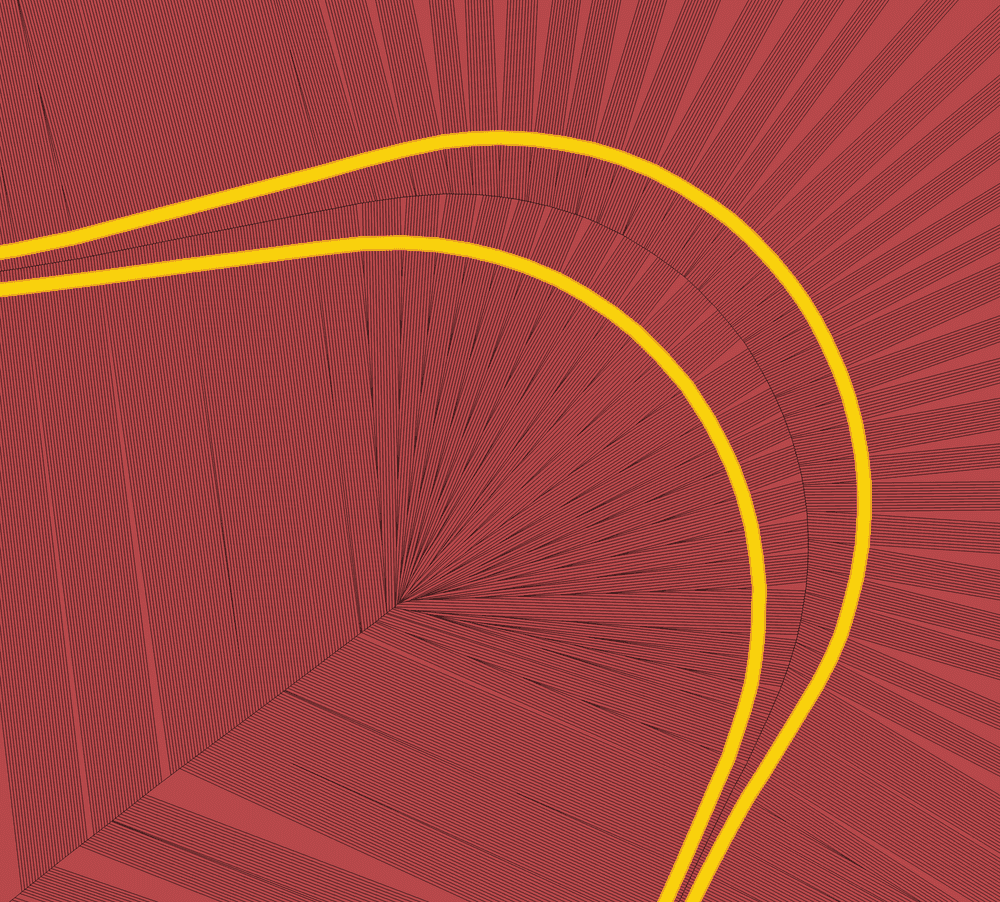
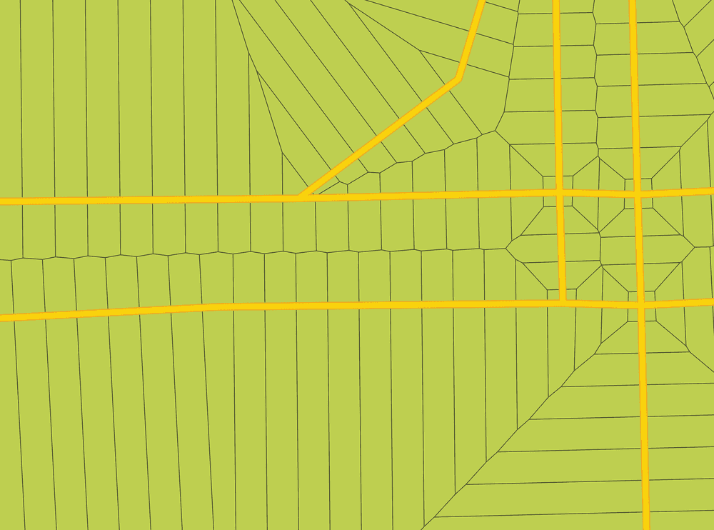
What have we just done? Let's illustrate it with the northeastern corner of Calgary's Stoney Trail.
I am a very visual thinker so I can struggle to explain this stuff with words: let's just say that Voronoi math is a computationally simple way to trace out a nearly perfect-looking center line.
A better algorithm designer (maybe the one on ESRI's payroll?) could probably automate this process even further. I'm not going to be doing this in more than a few cities a year, so I am fine with this level of effort. Let's use QGIS trace digitizing to draw a new line that follows the path suggested by our Voronoi shapes.
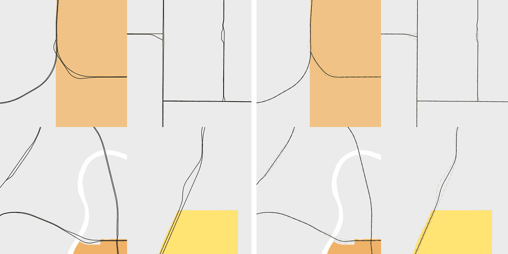
There's one more big problem we have to deal with: although our center line is pretty elegantly smooth, we had to make some sacrifices back at the Densify by interval stage. Subtle imperfections are inevitable, but they will all be smaller than the distance we set in that step. Here's an example of the bumpy "washboarding" effect that can happen:
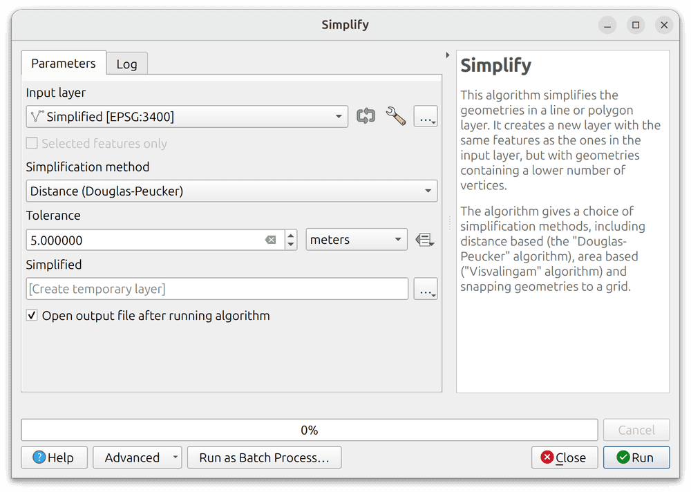
Only one thing to do about it! After tracing your center lines, run the QGIS Simplify algorithm on them, and use the same tolerance distance that you set in Densify by interval. For reasons that I only vaguely remember from signal processing classes in undergrad, this should fix all your problems. (Plus, it's good practice to simplify any big dataset that you're using for a cartographic project anyway.)
One more thing: intersections can behave a little oddly and you should probably be manually checking those as well. With this, I have no more to teach you.
Let's zoom in and check out the results:
We did it... yet another problem solved without needing to buy an ArcGIS license! (There are some additional ArcGIS problems that arise with proprietary file formats, I am absolutely not the right guy to help you with those ones.)
In my career, I've worked with a number of desktop GIS users who tend to neglect this kind of cartographic generalization work. Why? Most people are working on projects with a specific technical purpose. And that specific purpose is usually much more interesting than freeway median separations are.
Here's my best argument: because my work LOOKS polished, and a little traditional, it tends to get automatically trusted by the general public. (And that's terrifying!)
Yes, we live in an era of information overload, and it's created a very standard "half-heartedly made in GIS" visual style. So why not start taking the time now to question more aspects of your data sources and pick up some of the basics of cartographic generalization? Even if it seems like it's all being done for vanity, the habits you learn here will probably serve you well in the analysis portion of your workflow too.
