
If you've followed my work for a serious length of time, you've probably seen a lot of one of my favourite election mapping tools: the grid cartogram. I have made so many of these things over the years that I've almost forgotten how to explain the basics... but let's try anyway, because I wouldn't mind seeing cool election maps become more widespread.

Cartogram basics
The premise of any cartogram is simple: distort space to illustrate some other variable. Among other applications, this is a natural fit for the logic of a first-past-the-post election, where every legislator is assigned to one district. A distorted map that shows every electoral district at the same size, therefore, is going to give us a very useful overview of partisan strength in our legislature.
You may have seen approximately one gajillion catchy data visualizations over the years explaining that population density is not the same everywhere, and honestly if you are reading a cartography blog for fun I am not sure I need to bother explaining this concept any further. But if you want to look at visualizations of the 2016 U.S. presidential election until you shoot yourself, check out Kenneth Field's Thematic Mapping, available through ESRI Press.
There are other types of cartogram not covered here but I like grid cartograms for these reasons:
- A square just inherently looks like A Unit Thing
- A map full of squares looks like it's showing you Many Unit Things
- A lot of our administrative boundaries in Canada are already rectilinear
- Our language has four cardinal directions embedded into it
- Squares tessellate easily
Cartogram complexities
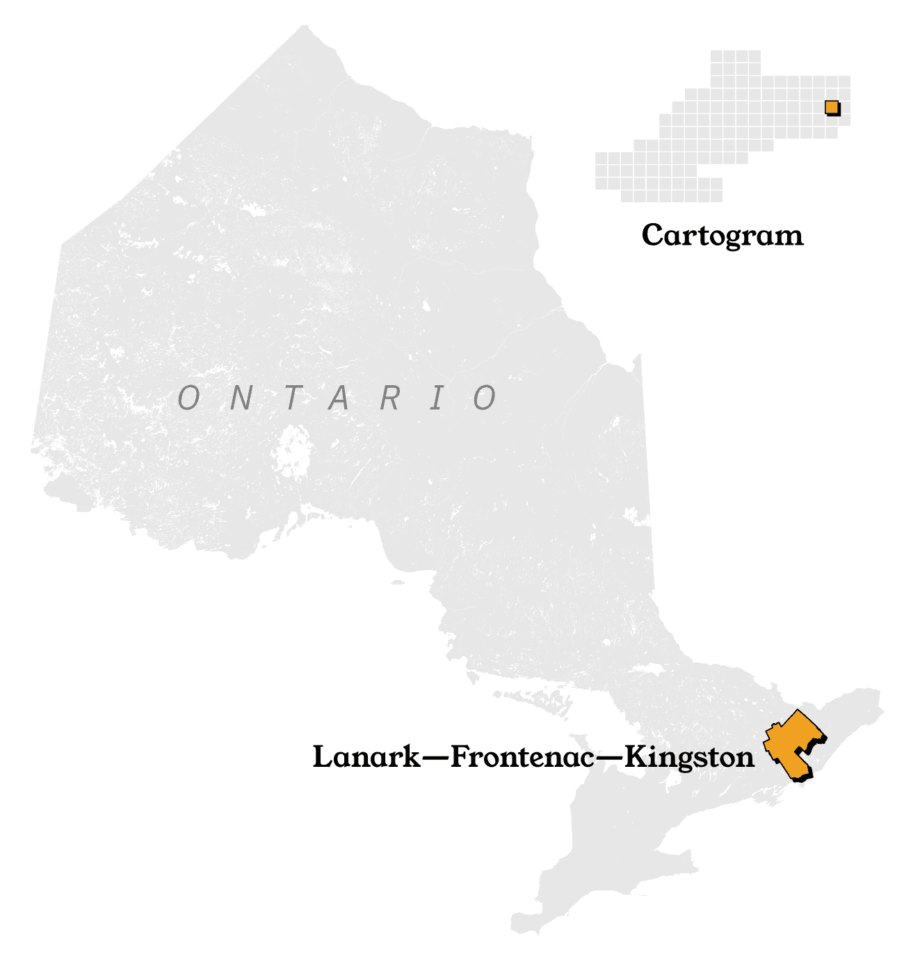
If only every electoral district was just like Lanark—Frontenac—Kingston. This mostly rural patch of Eastern Ontario elects 1 out of 124 MPPs, and its land area tidily accounts for about 1/124th of the province.
Unfortunately, as is so often the case, the full truth is more inconvenient.
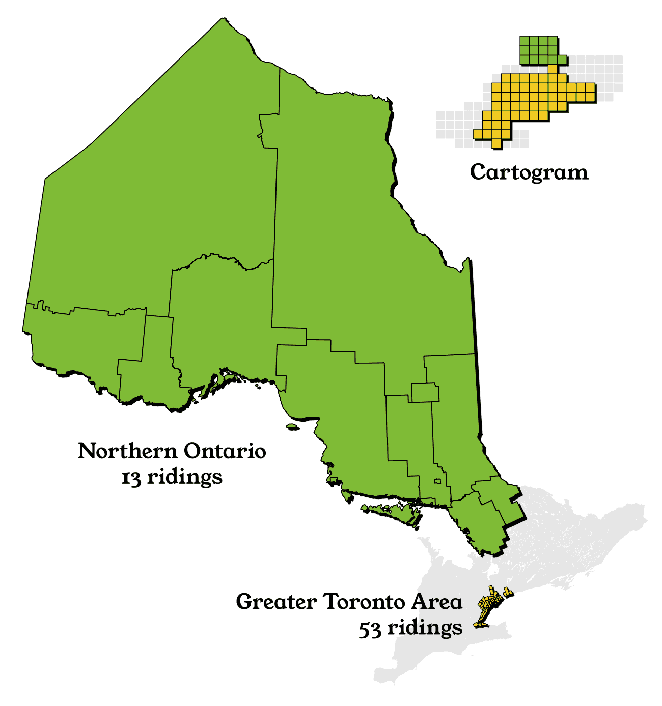
The disparity in Ontario is visually obvious, but running the actual numbers is impressive too!
| Region | MPPs | Area |
|---|---|---|
| North | 13 (10.5%) | 876,800 km² (88.8%) |
| GTA | 53 (42.7%) | 2,400 km² (0.2%) |
The average northern MPP represents 1,500 times more land area than the average GTA MPP.
There is no agreed-upon way to transform real geography into a distorted grid, and we live in an urbanized society where population density varies dramatically. In one sense, a cartogram never lies, but in most of the New World this comes at the cost of cartograms being fairly difficult to interpret.
Personally, I see them as an acquired taste. Not the most intuitive way to convey information at a glance to laypeople, but once you get used to them, it's hard to give up the habit.
(It's a different story in the United Kingdom, a country whose population density is much closer to homogenous. I knew that U.K. election cartograms achieved mainstream popularity in the 2010s, but while writing this post, I was shocked to uncover an example that was published in a major newspaper in 1895.)
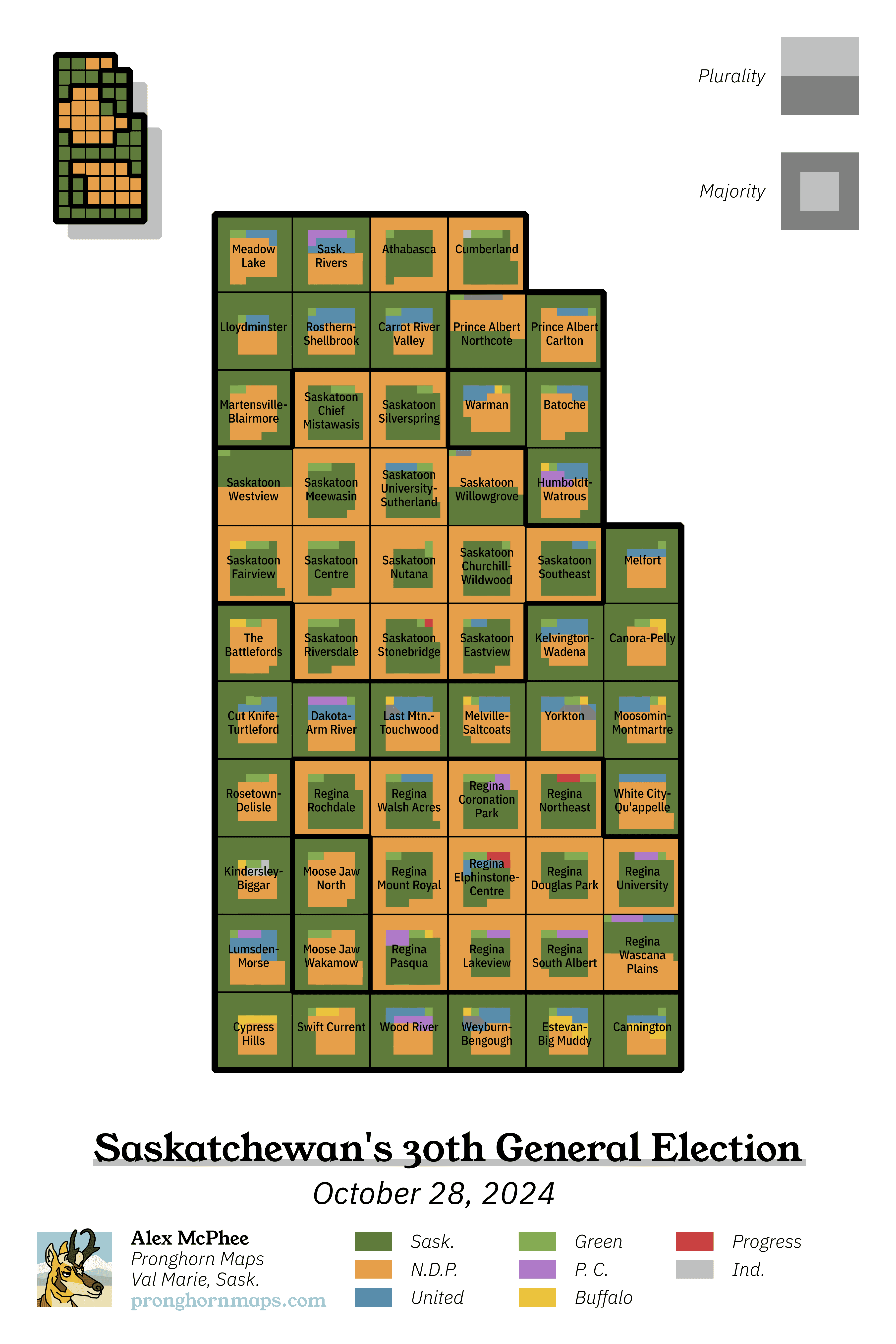
For jurisdictions with extreme and sharp distinctions in population density, it's also possible to make your cartograms a little more readable by using insets. That's what I tried to do with one of the first cartograms I ever made, way back in 2020.
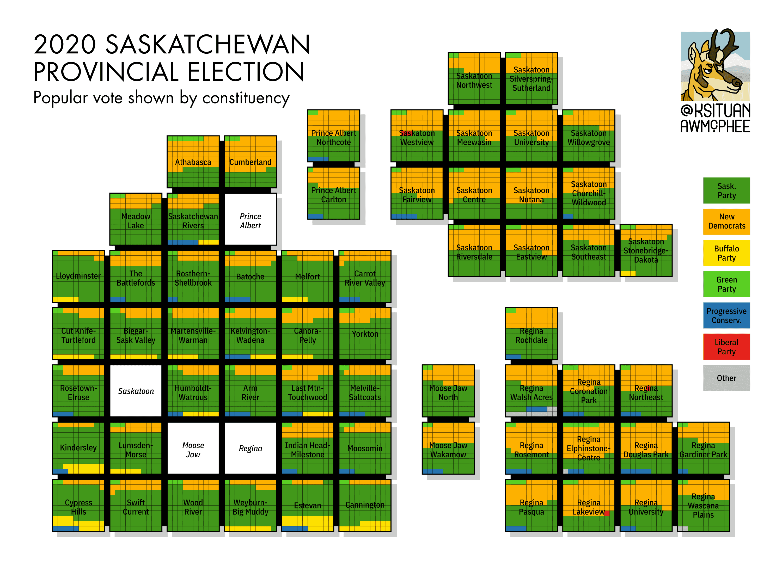
Why does this work? Exurbanization hasn't progressed very far in Saskatchewan, where Saskatoon and Regina are still greedily annexing new development land. With most new homes getting built inside the province's two cities proper, there are a lot of small urban ridings, a lot of large rural ridings, and not a lot of intermediate geography in between. (This started to change following the 2022 electoral boundary redistribution, after which the new ridings of Martensville-Blairmore, Warman, and White City-Qu'Appelle can all be considered fundamentally exurban.)
There is more to the art of arranging cartogram grid squares, and I have seen some algorithms that automatically calculate a trade-off between accurate topology and a recognizable outer shape, but I do it completely manually.
The biggest trick I use is purely artistic: just a couple squares can make the difference, serving as obvious shape-recognition "tells" that make the final cartogram clearly resemble the outline of Ontario, or Wales, or whatever your specific area of interest is. Here are some key details that I feel are necessary for making the United Kingdom immediately recognizable, even though we are distorting the relative scale of different areas quite a bit:

Balogh Pál
This is why I like the internet!!
Years ago, I randomly came across a striking Hungarian demographic map from 1902, which had been re-interpreted into a modern European election map. A fairly typical nationalistic project from this era of Central European history, it is also a remarkable early implementation of using 100 colourful grid squares to express percentages drawn from a complex dataset. If you know your historical geography, you can even pick out the shape of modern Hungary in red.
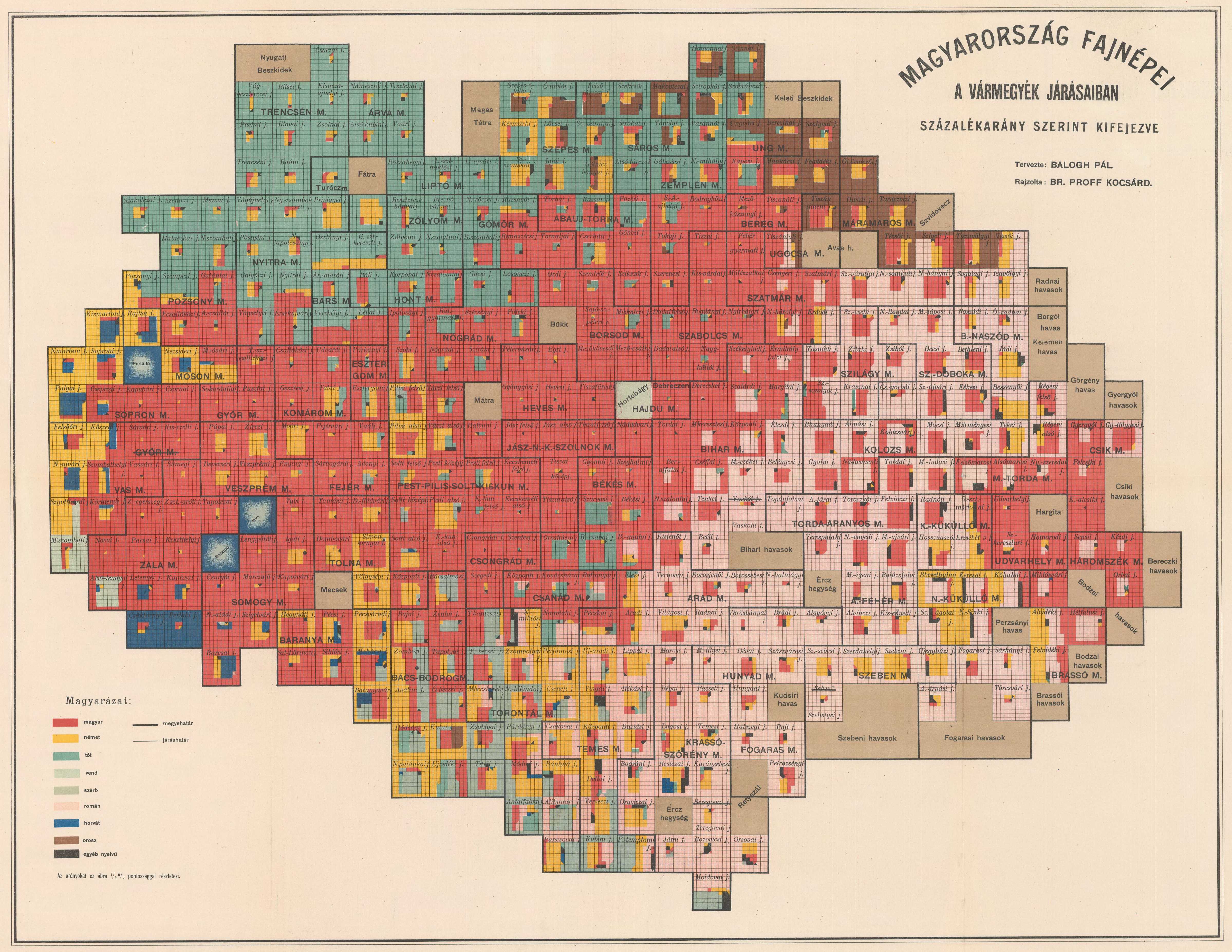
As soon as I ever laid eyes on this map format, I thought it would be perfect for Canadian election results, which share a few crucial features with Hungarian demography:
- A complex picture with more than two dominant players
- Very strong regionalism where some major parties barely register in certain parts of the country
- People only ever care about a few marginal areas that could go either way
- Weird nationalists will uncomfortably stare into your eyes and ramble about the topic for 5 hours
In my opinion, one of the best innovations here is the visual distinction between pluralities (<50%) and majorities (>50%). In addition to being academically interesting (the idea of narrow plurality victories is one of the most common moral arguments against the first-past-the-post voting system), it works really well on a map. By putting minorities in the centre of a majority grid square, a large swath of majority territories will form a continuous fabric of a single colour.

This is actually a little different from Pál's methodology, which seems to rotate grid squares randomly, or maybe based on local context. In 1902 there was no hope of automating any of this process, so it's possible that the original map is simply inconsistent by its nature.
Mass-producing grid cartograms
All cartograms distort space by their nature and start to push the boundaries of what a "map" is, therefore GIS software is not really the best tool for creating them. You are probably going to want to discover some way to programmatically work with a vector graphics editor.
In my case, I was already using Inkscape over Illustrator just because I'm cheap - but it turns out Inkscape's .svg editing chops are highly compatible with a number of other .svg manipulation tools, like Python's svgwrite library. If you are not super familiar with the .svg format, this script will probably not make a lot of sense to you, but at least it should run! Let's go through it notebook style.
As input, this program takes .csv election data in this format:
| District name | Party 1 | Party 2 | Etc. |
|---|---|---|---|
| Alert | 304 | 100 | 50 |
| Bell | 549 | 601 | 5 |
| Cabri | 283 | 301 | 300 |
| Delta | 123 | 261 | 294 |
Like most projects I write, we are going to need to import the pandas library because I'm not a real CS major.
import pandas as pd
import svgwrite
First we initialize some kind of riding object that we can manipulate...
# Create custom riding class

class Riding:
    def __init__(self, name, voteTotals, parties):
        self.name = name
        self.totalVotes = pd.Series(data=voteTotals, index=parties).astype(float)
        self.votePercents = self._getRemainders()
In order to turn a potentially complex dataset into 100 perfect little squares, we need to perform least-remainder percentage rounding. This is a little bit more complicated than normal rounding because we need to be sure that the final result adds up to 100 (it's very easy to accidentally get 99 or 101 if we rely on our elementary school knowledge and just use .5 as a breakpoint).
    # Do least remainder percentage rounding

    def _getRemainders(self):
        rawPercents = 100 * self.totalVotes / self.totalVotes.sum()
        roundPercents = rawPercents.astype(int)
        remainders = rawPercents - roundPercents
        outstandingPercents = 100 - roundPercents.sum()
        outstandingParties = remainders.nlargest(outstandingPercents).index
        roundPercents[outstandingParties] += 1

        return roundPercents
These two fields will soon come in handy.
    # Calculate some other useful fields

    def winningParty(self):
        return self.totalVotes.idxmax()

    def hasMajority(self):
        return self.totalVotes[self.winningParty()] / self.totalVotes.sum() > 0.5
We're done with class Riding, now let's create something that will navigate through our svg image and add coloured rectangles to it.
# Create a snake function that draws coloured squares

def Snake(startingPoint, rowlengths, colours, orientation, grp, dwg, cell_width):
    n = 0
    horizontalPosition = startingPoint[0]
    for row_index, row in enumerate(rowlengths):
        for step in range(row):
            if (row_index+orientation)%2 == 0:
                horizontalPosition = horizontalPosition + 10
                grp.add(dwg.rect((horizontalPosition - 10, startingPoint[1] - row_index*10), (10, 10), fill=colours[n], stroke=colours[n], stroke_width=cell_width))
            else:
                horizontalPosition = horizontalPosition - 10
                grp.add(dwg.rect((horizontalPosition, startingPoint[1] - row_index*10), (10, 10), fill=colours[n], stroke=colours[n], stroke_width=cell_width))
            n += 1
Now we define an election_cartogram function. This function needs to be given a dictionary of party colours, an input filename, an indication of which column in our input file contains the district names, an output filename, and a small line width parameter to remove tiny visual gaps in the output .svg file.
def election_cartogram(brand_colours, filename, label_column, output_filename, cell_width=0.3):

    # Import data

    election = pd.read_csv(filename, engine='c')

    # Remove empty rows and columns

    numbers = election.drop(label_column,axis=1)

    election = election.loc[(numbers!=0).any(axis=1)]

    election = election.dropna(axis='rows',how='all')
    election = election.dropna(axis='columns',how='all')

    # Create an array of ridings using our custom class

    ridings = [Riding(row[label_column], row.drop(labels=[label_column]), row.drop(labels=[label_column]).index) for _, row in election.iterrows()]

    # We are now ready to start drawing shapes!

    # Let's make some rules to arrange the output in a nice grid.

    layout_width = int(len(ridings)**0.5)

    # And initialize the svg...

    dwg = svgwrite.Drawing(output_filename, size=(layout_width*110 - 10,int(1 + len(ridings)/layout_width)*110 - 10), profile="tiny")
And here's where we iterate through every spreadsheet row and turn it into a picture!! This is a fairly unwieldy chunk of code that could probably be improved by a smarter person - most of these lines are spent manually defining the shape of the exact spiral that we want our script to produce for those complex majority ridings. (We're going to need a slightly different shape for every single majority value from 50% to 100%.)
    for riding_index,riding in enumerate(ridings):

       # Implement grid positioning.

       pos_x = (riding_index % layout_width) * 110
       pos_y = int(riding_index/layout_width) * 110

       # Check which party has the most votes.

       sort_order = riding.totalVotes.sort_values(ascending=False).index
       sorted_colours = pd.Series(brand_colours).reindex(sort_order,fill_value=brand_colours['Other'])
       colour = sorted_colours.repeat(riding.votePercents.reindex(sort_order))

        # Put what we're about to draw into an svg group.

       grp = dwg.g()

    # Find out if the winning party has a majority or not...

       if riding.hasMajority():

           step = 0

            # This giant block of statements just describes a spiral.

           while step <= riding.votePercents[riding.totalVotes.idxmax()] - 1:
                step_colour = colour.iat[0]
                colour = colour.iloc[1:]
                if step >= 0 and step <= 9:
                    grp.add(dwg.rect((0 + pos_x, 90 - step*10 + pos_y), (10, 10), fill=step_colour, stroke=step_colour, stroke_width=cell_width))
                if step >= 10 and step <= 18:
                    grp.add(dwg.rect((10 + (step-10)*10 + pos_x, 0 + pos_y), (10, 10), fill=step_colour, stroke=step_colour, stroke_width=cell_width))
                if step >= 19 and step <= 27:
                    grp.add(dwg.rect((90 + pos_x, 10 + (step-19)*10 + pos_y), (10, 10), fill=step_colour, stroke=step_colour, stroke_width=cell_width))
                if step >= 28 and step <= 35:
                    grp.add(dwg.rect((80 - (step-28)*10 + pos_x, 90 + pos_y), (10, 10), fill=step_colour, stroke=step_colour, stroke_width=cell_width))
                if step >= 36 and step <= 43:
                    grp.add(dwg.rect((10 + pos_x, 80 - (step-36)*10 + pos_y), (10, 10), fill=step_colour, stroke=step_colour, stroke_width=cell_width))
                if step >= 44 and step <= 50:
                    grp.add(dwg.rect((20 + (step-44)*10 + pos_x, 10 + pos_y), (10, 10), fill=step_colour, stroke=step_colour, stroke_width=cell_width))
                if step >= 51 and step <= 57:
                    grp.add(dwg.rect((80 + pos_x, 20 + (step-51)*10 + pos_y), (10, 10), fill=step_colour, stroke=step_colour, stroke_width=cell_width))
                if step >= 58 and step <= 63:
                    grp.add(dwg.rect((70 - (step-58)*10 + pos_x, 80 + pos_y), (10, 10), fill=step_colour, stroke=step_colour, stroke_width=cell_width))
                if step >= 64 and step <= 69:
                    grp.add(dwg.rect((20 + pos_x, 70 - (step-64)*10 + pos_y), (10, 10), fill=step_colour, stroke=step_colour, stroke_width=cell_width))
                if step >= 70 and step <= 74:
                    grp.add(dwg.rect((30 + (step-70)*10 + pos_x, 20 + pos_y), (10, 10), fill=step_colour, stroke=step_colour, stroke_width=cell_width))
                if step >= 75 and step <= 79:
                    grp.add(dwg.rect((70 + pos_x, 30 + (step-75)*10 + pos_y), (10, 10), fill=step_colour, stroke=step_colour, stroke_width=cell_width))
                if step >= 80 and step <= 83:
                    grp.add(dwg.rect((60 - (step-80)*10 + pos_x, 70 + pos_y), (10, 10), fill=step_colour, stroke=step_colour, stroke_width=cell_width))
                if step >= 84 and step <= 87:
                    grp.add(dwg.rect((30 + pos_x, 60 - (step-84)*10 + pos_y), (10, 10), fill=step_colour, stroke=step_colour, stroke_width=cell_width))
                if step >= 88 and step <= 90:
                    grp.add(dwg.rect((40 + (step-88)*10 + pos_x, 30 + pos_y), (10, 10), fill=step_colour, stroke=step_colour, stroke_width=cell_width))
                if step >= 91 and step <= 93:
                    grp.add(dwg.rect((60 + pos_x, 40 + (step-91)*10 + pos_y), (10, 10), fill=step_colour, stroke=step_colour, stroke_width=cell_width))
                if step >= 94 and step <= 95:
                    grp.add(dwg.rect((50 - (step-94)*10 + pos_x, 60 + pos_y), (10, 10), fill=step_colour, stroke=step_colour, stroke_width=cell_width))
                if step >= 96 and step <= 97:
                    grp.add(dwg.rect((40 + pos_x, 50 - (step-96)*10 + pos_y), (10, 10), fill=step_colour, stroke=step_colour, stroke_width=cell_width))
                if step >= 98 and step <= 99:
                    grp.add(dwg.rect((50 + pos_x, 40 + (step-98)*10 + pos_y), (10, 10), fill=step_colour, stroke=step_colour, stroke_width=cell_width))

                step += 1

                # The outer spiral is complete.
                # Now switch to drawing a snake.
                # A lot of different paths are possible.

           majority = riding.votePercents[riding.totalVotes.idxmax()]

           snake_params = {50 : (20, 80, [7,7,7,7,7,7,7,1], 0),
                           51 : (20, 80, [7,7,7,7,7,7,7], 0),
                           52 : (20, 80, [7,7,7,7,7,7,6], 0),
                           53 : (90, 80, [7,7,7,7,7,6,6], 1),
                           54 : (20, 80, [7,7,7,7,6,6,6], 0),
                           55 : (90, 80, [7,7,7,6,6,6,6], 1),
                           56 : (20, 80, [7,7,6,6,6,6,6], 0),
                           57 : (90, 80, [7,6,6,6,6,6,6], 1),
                           58 : (20, 80, [6,6,6,6,6,6,6], 0),
                           59 : (70, 80, [5,6,6,6,6,6,6], 1),
                           60 : (60, 80, [4,6,6,6,6,6,6], 1),
                           61 : (50, 80, [3,6,6,6,6,6,6], 1),
                           62 : (40, 80, [2,6,6,6,6,6,6], 1),
                           63 : (30, 80, [1,6,6,6,6,6,6], 1),
                           64 : (20, 70, [6,6,6,6,6,6], 0),
                           65 : (30, 70, [5,6,6,6,6,6], 0),
                           66 : (80, 70, [5,5,6,6,6,6], 1),
                           67 : (30, 70, [5,5,5,6,6,6], 0),
                           68 : (80, 70, [5,5,5,5,6,6], 1),
                           69 : (30, 70, [5,5,5,5,5,6], 0),
                           70 : (30, 70, [5,5,5,5,5,5], 0),
                           71 : (30, 70, [5,5,5,5,5,4], 0),
                           72 : (30, 70, [5,5,5,5,5,3], 0),
                           73 : (30, 70, [5,5,5,5,5,2], 0),
                           74 : (30, 70, [5,5,5,5,5,1], 0),
                           75 : (30, 70, [5,5,5,5,5], 0),
                           76 : (30, 70, [5,5,5,5,4], 0),
                           77 : (80, 70, [5,5,5,4,4], 1),
                           78 : (30, 70, [5,5,4,4,4], 0),
                           79 : (80, 70, [5,4,4,4,4], 1),
                           80 : (30, 70, [4,4,4,4,4], 0),
                           81 : (60, 70, [3,4,4,4,4], 1),
                           82 : (50, 70, [2,4,4,4,4], 1),
                           83 : (40, 70, [1,4,4,4,4], 1),
                           84 : (30, 60, [4,4,4,4], 0),
                           85 : (40, 60, [3,4,4,4], 0),
                           # No federal riding in Canada has a greater majority than 85.
                           # Proceed with caution, these are untested.
                           86 : (70, 60, [3,3,4,4], 1),
                           87 : (40, 60, [3,3,3,4], 0),
                           88 : (40, 60, [3,3,3,3], 0),
                           89 : (40, 60, [3,3,3,2], 0),
                           90 : (40, 60, [3,3,3,1], 0),
                           91 : (40, 60, [3,3,3], 0),
                           92 : (40, 60, [3,3,2], 0),
                           93 : (60, 60, [3,2,2], 1),
                           94 : (40, 60, [2,2,2], 0),
                           95 : (50, 60, [1,2,2], 1),
                           96 : (40, 50, [2,2], 0),
                           97 : (50, 50, [1,2], 0),
                           98 : (50, 50, [1,1], 0),
                           99 : (40, 50, [1], 0),
                           100: (0, 0, [0], 0)}

           init_x, init_y, snake_rows, snake_orientation = snake_params[majority]
           Snake((init_x + pos_x, init_y + pos_y), snake_rows, colour, snake_orientation, grp, dwg, cell_width)

       else:

            # If no party has a majority, we just need to draw a simple snake pattern

            Snake((pos_x,90 + pos_y), [10,10,10,10,10,10,10,10,10,10], colour, 0, grp, dwg, cell_width)

       # Add an outline to the grid cell, if you want

       grp.add(dwg.rect((0 + pos_x,0 + pos_y),(100,100),fill='none',stroke='black',stroke_width=2))

       dwg.add(grp)

       # Add the riding label

       dwg.add(dwg.text(riding.name,insert=(50 + pos_x,50 + pos_y),
                        fill='black',
                        text_anchor='middle',
                        font_size='12pt',
                        font_family="IBM Plex Sans Condensed Medium"))
Finally, our loop is done and we are ready to update the .svg canvas!!!
    # Now save it all...

    dwg.save()
And the last thing we need to run this script is that dictionary of party colours - here are the exact hex codes that I like to use.
# Define party colours

brand_colours = {'Liberal Party of Canada':  '#c94141', # Red
                'New Democratic Party' : '#e69f4a', # Orange
                'Libertarian Party of Canada': '#ebc53f', # Yellow
                'Green Party of Canada': '#85ab53', # Green
                'Reform Party of Canada' : '#5f7b3b', # Dark green
                'Bloc Québécois': '#88c9c3', # Teal
                'Conservative Party of Canada': '#598dab', # Blue
                "People's Party of Canada": '#af7ac8', # Purple
                'Workers Party of Britain': '#8b4943', # Maroon
                'Other': '#bfbfbf'} # Gray; unspecified colours automatically go here

# Run election_cartogram

election_cartogram(brand_colours, 'Data//saskatchewan_2024.csv', 'Riding', 'Saskatchewan 2024 ridings.svg')
Let's open up Inkscape immediately!! What does the final output look like?
Some assembly required
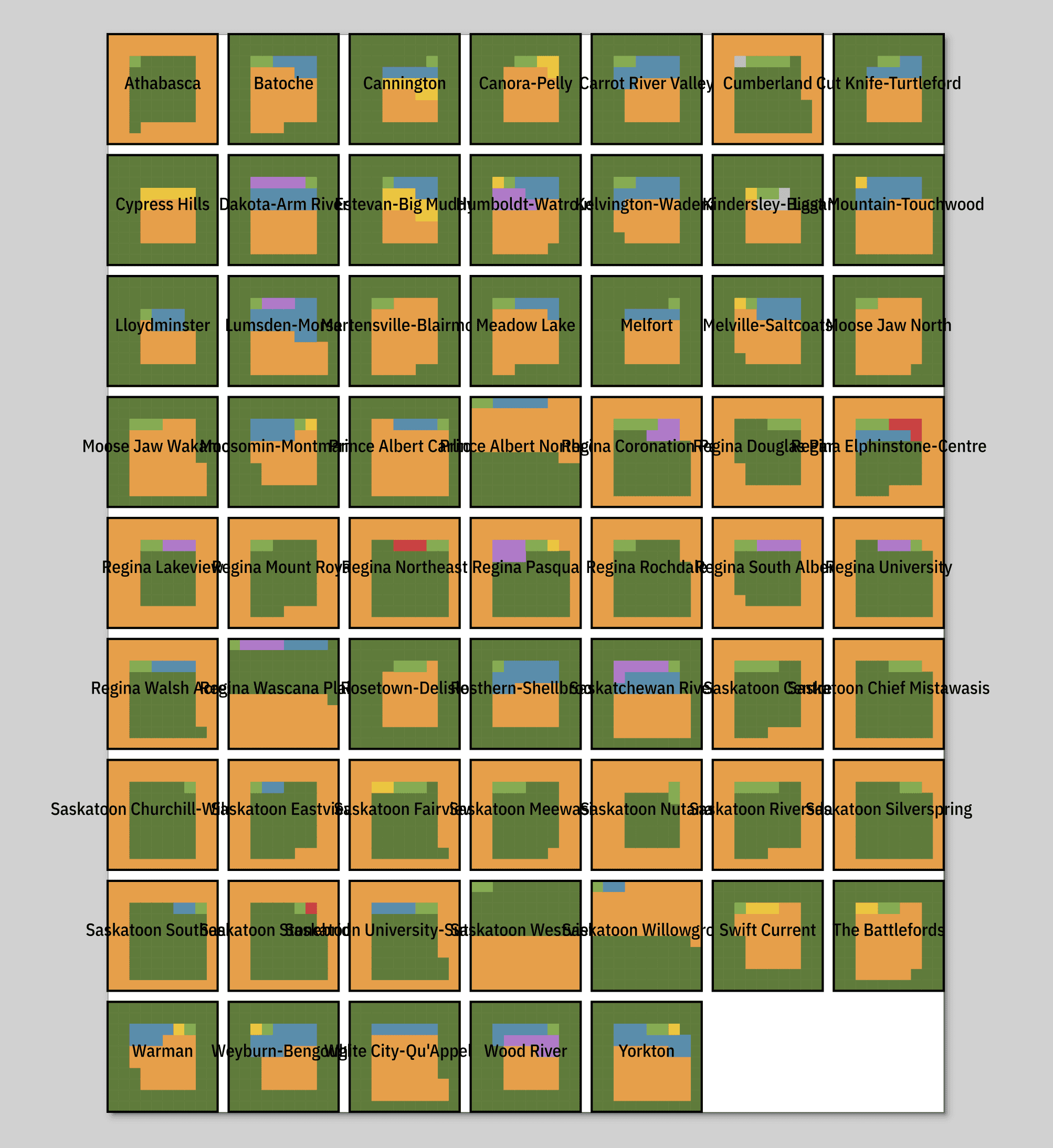
As previously mentioned, I don't like to use automatic shortcuts when it comes to the manual labour of assembling these grid squares into the desired final form. I'm also a control freak when it comes to typography, so I'm going to be adding every line break and abbreviation myself. The good news is that these blocks are already arranged into .svg groups that match the dimensions of Inkscape's default grid, so dragging them around the canvas is as quick and easy as it could possibly be.
Let's just briefly skip over all that skilled graphic design work that makes me difficult to replace with a chatbot. Hey, I'm not going to give away ALL of my secrets.
Bingo! You now know probably a full 80% of what goes into my election cartogram process.
Although I keep incautiously calling it "my election cartogram process", these types of visualizations can really be used for all kinds of datasets (hence this map style originally being developed for a demographic census project). Whether you're dealing with electoral geography, municipalities, states, or countries, I challenge you to go find something interesting to drop into this script!

