I am really proud of my work as a cartographer. There is one thing I feel is difficult to communicate to people outside the field: exactly how much effort it all takes!!
On one hand, at my best I can make it look really easy. On the other hand, most people assume that my job is borderline magical in the first place. Let me demystify the process by reverse-engineering all of the actual milestones that go into a typical small project, from beginning to end.
This is a brief, conceptual walk through my everyday workflow. Actually implementing these design choices with software is outside the scope of this post. For the record, you can download QGIS and Inkscape for free to do everything I do, right now.
Setting a scope
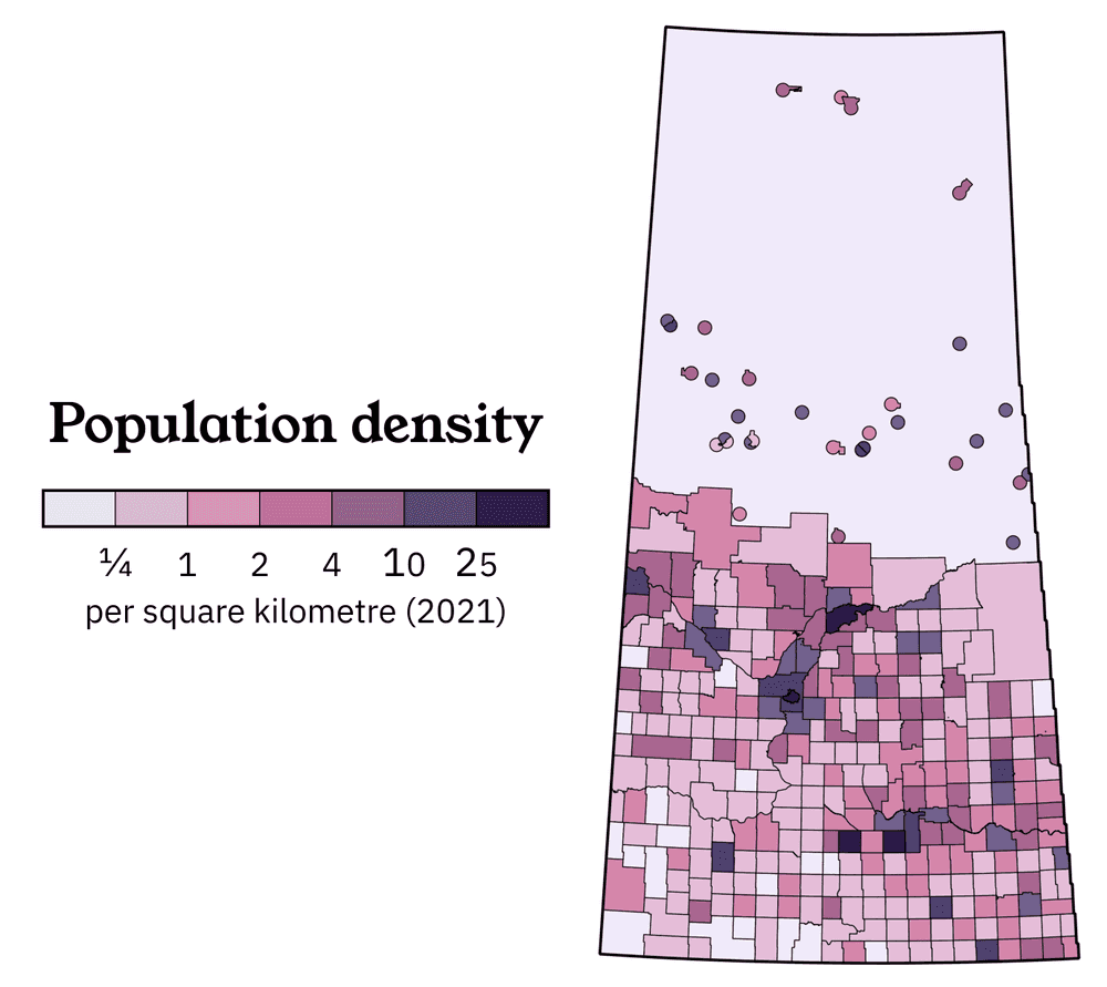
Let's say that you published an award-winning map of Saskatchewan (ahem) that sold 2,000 copies in a year, and you want to add some exciting new features to your second print run. How about a cute little population density inset?
Choosing a reasonable scope is a good way to start any project. We have our jurisdiction (the province of Saskatchewan) and our demographic variable (population density). Here are two additional considerations: it needs to be easily readable when printed at 2 inches tall, as well as fully colourblind accessible.
Okay, that's enough thinking about the assignment. This map has a suitable theoretical basis. Let's untangle all the assumptions and random pieces of local knowledge that went into making it!
Finding a source
Almost all of the data I work with already exists out there somewhere, I am just a specialist in making it look good.
We are going to be getting population counts from the 2021 census. Lucky us: we can go straight to Statistics Canada's inventory of official census data products, which are designed to pair perfectly with Statistics Canada's inventory of official census boundaries. Navigating federal government websites is difficult and tedious, but at least we can be pretty confident that we are getting the best possible information straight from the source.
Wait a minute, there are so many different downloads here...
Choosing a level of detail
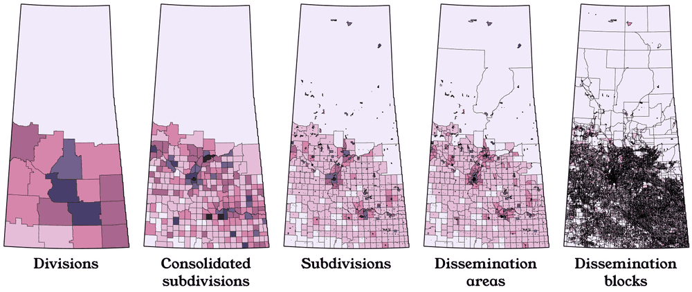
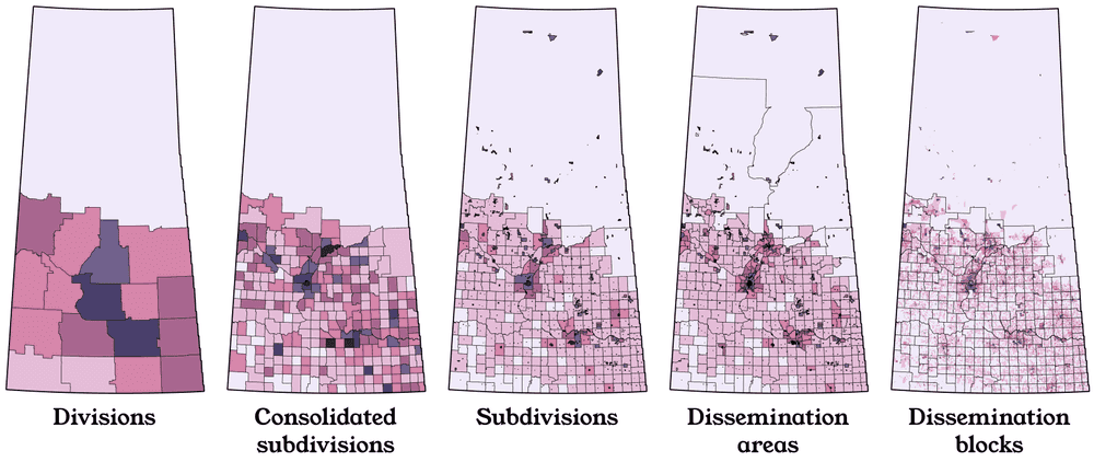
Statistics Canada offers the same census data at all kinds of levels of geographic detail. Check out the five most standard:
Can you guess which one actually conforms to administrative reality? "Census subdivisions" are a complete inventory of every municipality and Indian reserve, and are revised whenever new municipalities are created or destroyed. The other four datasets here either arbitrarily lump them together, or arbitrarily break them apart. This is done at Statistics Canada's discretion.
I feel like a very common misconception about my work is that I must always be trying to create "the most accurate" map. Wrong! The most accurate population density map would use dissemination blocks, but how useful is that going to be when we only have two inches of space on the page?
Yes, okay, yes, I am being a little unfair by showing all the census block boundaries in solid black. (It's nothing personal!! I love that census block data exists, and I use it for all kinds of projects.) We can eliminate those outlines, immediately creating a more readable product:
But I still don't really like this.
-
On a conceptual level, it's pretty, but the extremely fine detail is visually distracting. Most census blocks are smaller than the average farm, so our light pink "zero" colour pops up EVERYWHERE. This means we're actually losing our ability to quickly compare the density of rural settlement in different parts of the province.
-
On a temporal level, the boundaries of census blocks are extremely arbitrary, and change between censuses all the time. Even if the province's population was frozen in place for the next 5 years, the next census would use different blocks, and this map would end up looking different. We can't stop our data from getting old, but a little bit of future-proofing never hurts.
-
On a technical level, this is a ridiculous amount of superfluous detail for a 2 inch map! Your digital printer can probably still handle a 50MB file meant to be the size of your finger, but a huge amount of detail will be lost and you ought to be nicer to your equipment.
For most GIS users, I find there is a sort of beginner's euphoria once a person first gains the technical ability to process and visualize huge government datasets in their raw form. Certainly nobody ever told ME that something as beautiful and complex as the 2021 dissemination block data even existed, much less that it was free to any member of the public. You can see all kinds of viral data-is-beautiful posts everywhere on the internet that show a complete information overload, often to the point of practical uselessness.
I personally like that census subdivisions are the most firmly "real": most laypeople are aware of the name of their municipality. I DON'T like that Saskatchewan is full of tiny, enclaved towns that are completely impossible to pick out in images 3-5. This makes me favour consolidated subdivisions, which look tidy, are broadly comparable across the province, and haven't changed much in 100 years. We have our starting point!
Manual revisions to the data
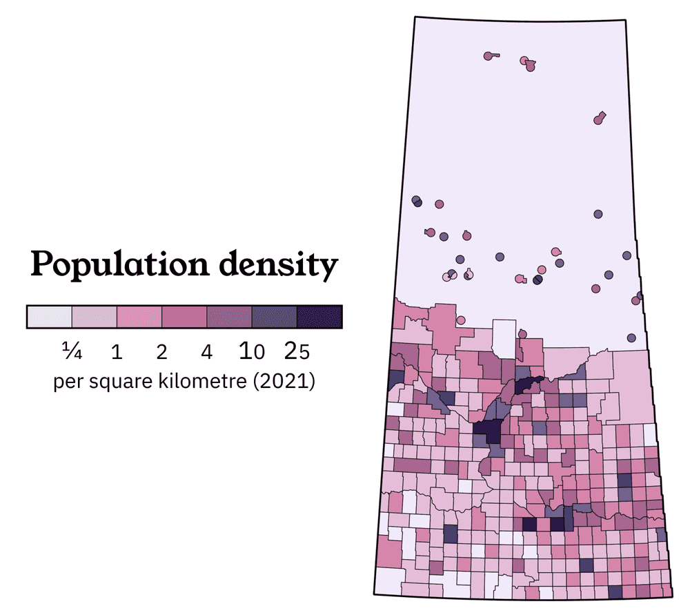
On all five of these maps, you can see that Northern Saskatchewan (where the topsoil runs out) is dramatically less populated than the other half of the province. On the subdivision, DA, and DB maps, you can see that Northern Saskatchewan's population (which still exists, and numbers about 40,000) is extremely concentrated into small urban clusters. But the consolidated subdivisions map, although ideal for tidying up the southern half of the province, doesn't show these northern communities at all. Let's mix and match two different census datasets:
Looking better already! Unfortunately, at our target 2-inch size, almost all of the oddly-shaped subdivisions in the north are unreadable, and I happen to know that their shapes aren't really related to their populated footprints anyway. Just looking at these boundaries, you might incorrectly think that Black Lake (the triangle at the very top of the province) is the largest community in Northern Saskatchewan.
How could we be a little more fair? After a bit of experimentation with different shapes and different radii, I decided to draw a 9-kilometer circle around every major population centre. This is completely arbitrary, but it's a decent enough fit for the reality of life in the North, where space is plentiful and a large minority of people will often live in cabins a short distance away from the nearest urban community. (While seasonal properties can be found in the most remote locations, almost nobody maintains a permanent address in the true middle of nowhere.)
It worked! You can now distinguish the bigger communities from the smaller communities at a single glance, and even without knowing anything about Saskatchewan, it's easy to spot the two biggest northern population centres.
You might notice a few odd nodules on some of these circles. Although we can often safely assume that nobody lives in the extreme corners of a large northern municipality, I don't think this assumption is safe enough, so I've made some manual revisions to accomodate administrative boundaries as needed.
Are we done yet? No... there are some other judgment calls with the consolidated subdivisions that I don't like.
-
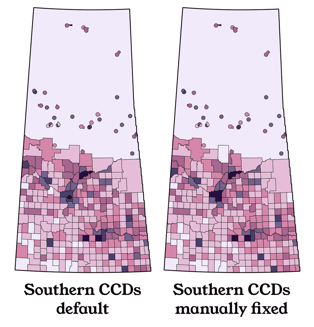
If you look really closely, you'll notice that Statistics Canada decided to avoid consolidating Saskatoon with its surrounding R.M. of Corman Park, but they DID consolidate Regina with its surrounding R.M. of Sherwood. Their rationale was probably that Sherwood has a much smaller population, but I think the final result looks awkward and establishes a weird double standard.
-
If you look really, really closely, you'll see a bit of mess ("border gore") in the boundaries of some southern CCDs. This is because some First Nations, in recent decades, have successfully sued the government and earned uninhabited land as compensation for historical broken treaties. This "Treaty Entitlement" land is often scattered randomly across multiple municipalities, and the census is very inconsistent about whether to recognize its existence or not.
-
If you look really, really, really closely, you'll see that CCDs never break any municipal boundaries, even when it would make sense. For instance, the City of Prince Albert has a large tentacle extending north of the North Saskatchewan River, not because of any human neighbourhoods, but because it adds a lumber mill to the city tax base.
Although most of them are really barely noticeable, I used provincial government boundary data to manually fix all these little problems.
All these manual revisions require re-calculating the area of every shape we're drawing, although our population counts are still 100% rooted in the census. You can see a few spots where this ends up bumping a region between density brackets.
Simplifying the geometry
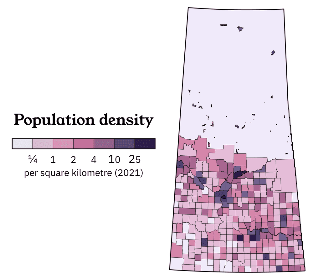
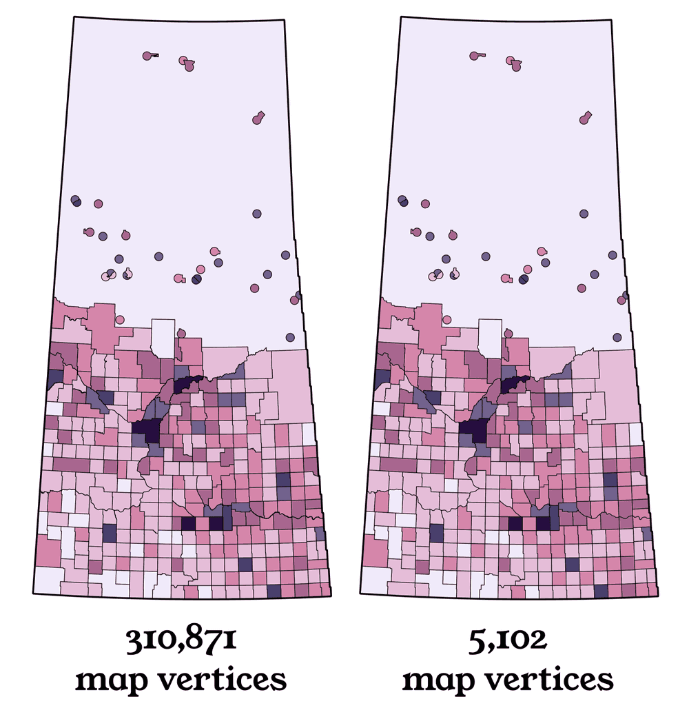
It NEVER hurts to make sure that a final printed product has a reasonable file size. Can you spot the difference between these two maps?
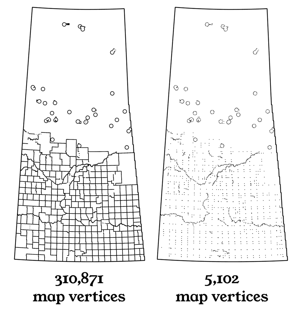
Your computer sure can! The map on the left rings in at 5.3 MB in its original file format, and the map on the right is a mere 122 KB. Here's what that looks like behind the curtain:
The fully detailed file will still be necessary in case you need to update any of the data, so don't throw it away! Choosing a level of simplification is one of the many completely arbitrary steps in my everyday workflow, and everybody has a different preference for how extreme they're willing to get.
Choosing a colour scale
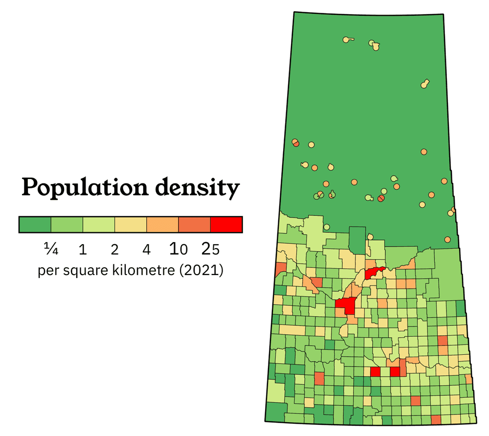
At this point in the post, you're probably pretty used to my colour scale, but how exactly did I settle on ¼, 1, 2, 4, 10, and 25 as my "break points"? The answer is a lot of manual trial and error. Let's test some basic assumptions.
It's easy to naively assume that the colour scale on a map should be perfectly linear. That leaves no room for bias, right?
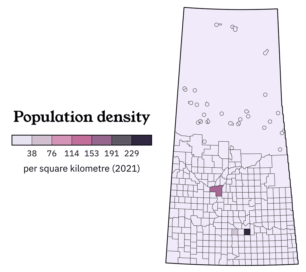
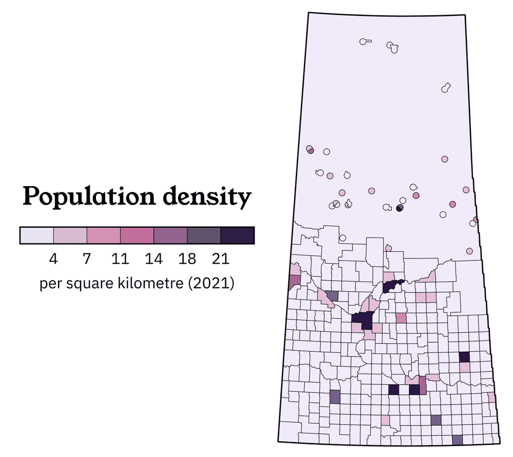
This is not inaccurate, but it's unsatisfactory for a few reasons. (One of the more annoying ones is that the larger city of Saskatoon falls into a lower density bracket.) So it's obvious that the big cities are very different from the rest of the province, what if we just cap the map at 25 while keeping a linear scale?
This is also not technically inaccurate, but we're still missing out on a lot of detail.
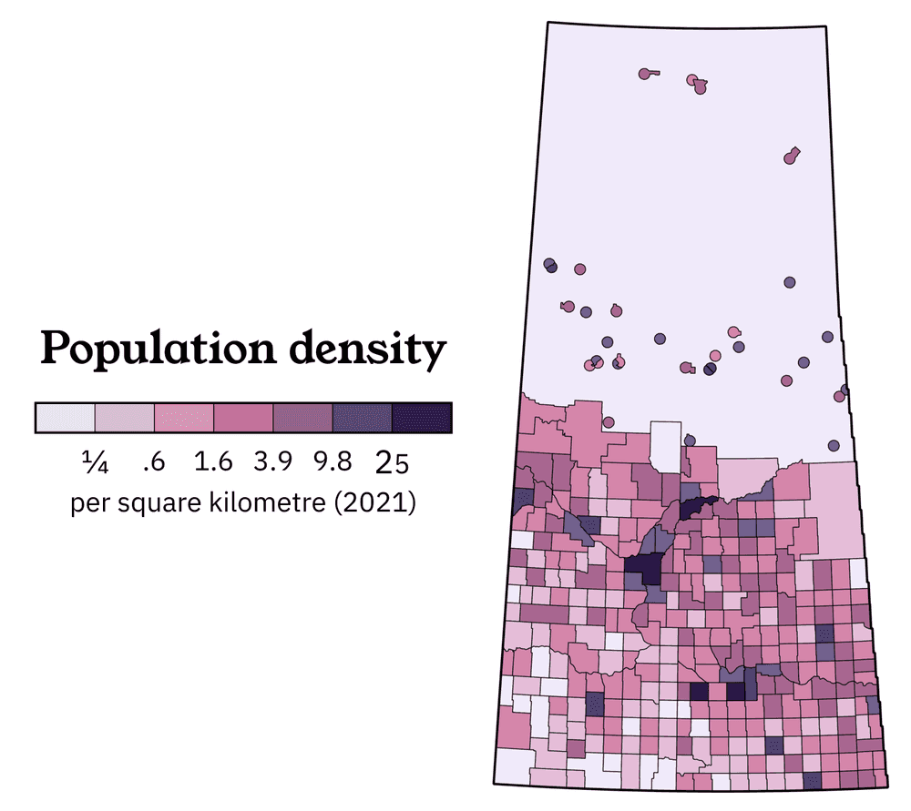
For reasons that I am honestly not fully in the loop about, logarithmic scales are usually a better choice for a wide diversity of human datasets: every society on Earth tends to naturally develop a predictable hierarchy of town population sizes. (See Zipf's law if you want to be mildly disturbed by the similarities between the size of every town in Saskatchewan and the length of every word in Don Quixote.)
Let's use some high school math to calculate four logarithmic break points between ¼ and 25... and hey, these numbers look kind of familiar!
I actually didn't originally use this method to calculate my colour scale, I literally just tried a large variety of possible values after setting ¼ and 25 as my two cutoff points. (If you ever want to feel better about citing "random trial and error" as a problem-solving approach, just talk like a physicist and say that you used the Monte Carlo method).
The agreement between 1.6 vs. 2, 3.9 vs. 4, and 9.8 vs. 10 are surprisingly excellent. Math is kind of scary!
When evaluating the quality of your break points, it helps to think whether they actually correspond to any real distinctions that people might care about. In this case, I think the answer is yes! Here's how I do a common sense test on my final result:
| Density bracket | Description |
|---|---|
| 25 and up | Metropolitan areas |
| 10 - 25 | Regional cities |
| 4 - 10 | Towns big enough to have multiple car dealerships |
| 2 - 4 | Towns that struggle to retain car dealerships |
| 1 - 2 | Places where the farmers are a little wealthier |
| ¼ - 1 | What you see out the window on a road trip |
| Below ¼ | Semi-arid cowboy country OR boreal wilderness |
One final breakpoint tip: in general, I prefer to use nice round numbers because most members of the general public do not appreciate being reminded that logarithms exist.
Choosing a colour ramp
We're so close to the finish line! What's the deal with all this pink and purple?
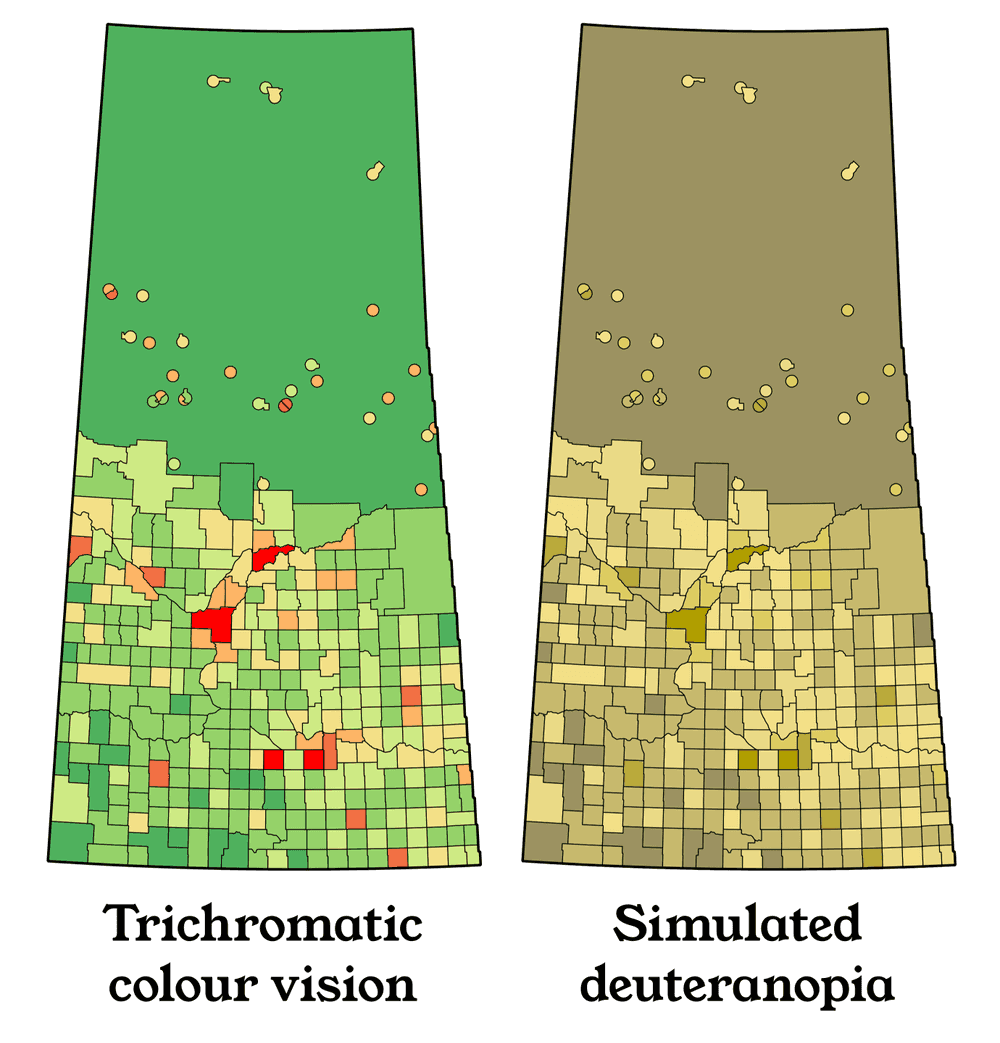
A lot of population density maps on the internet use a green-to-red colour ramp that doesn't look too offensive, and most people intuitively "get" the emotional meaning behind the colours:
Here's the problem. About 1 in 15 white guys experience some form of red-green colourblindness, so green-to-red is actually one of the worst possible ramps you can pick for accessibility.
The way that different digital screens from different manufacturers display the same web colours differently is its own obnoxious can of worms. Don't even get me started on dealing with printers. Seriously.
Here's a simulation of what people with full red-green deficiency see in this map:
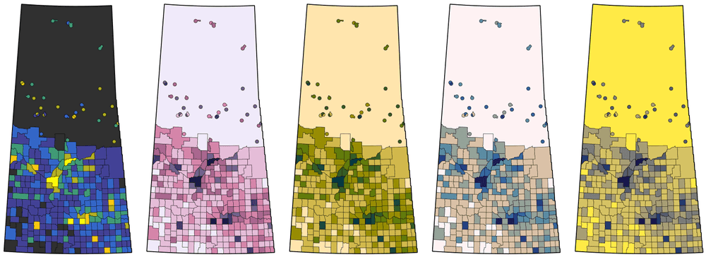
With the way that colour deficiencies are distributed in the general population, blue-yellow is the safest choice for a diverging colour ramp, but in general, nothing is safer than "photocopier-safe": colour ramps that are designed to work when reproduced in black and white. These are developed by people who study the human perception of colour and can be found in a few places around the internet. My favourite source is Fabio Crameri's scientific colour map website.
All of these choices are functional, but Crameri's purplish acton colour ramp is my personal favourite.
We're done!
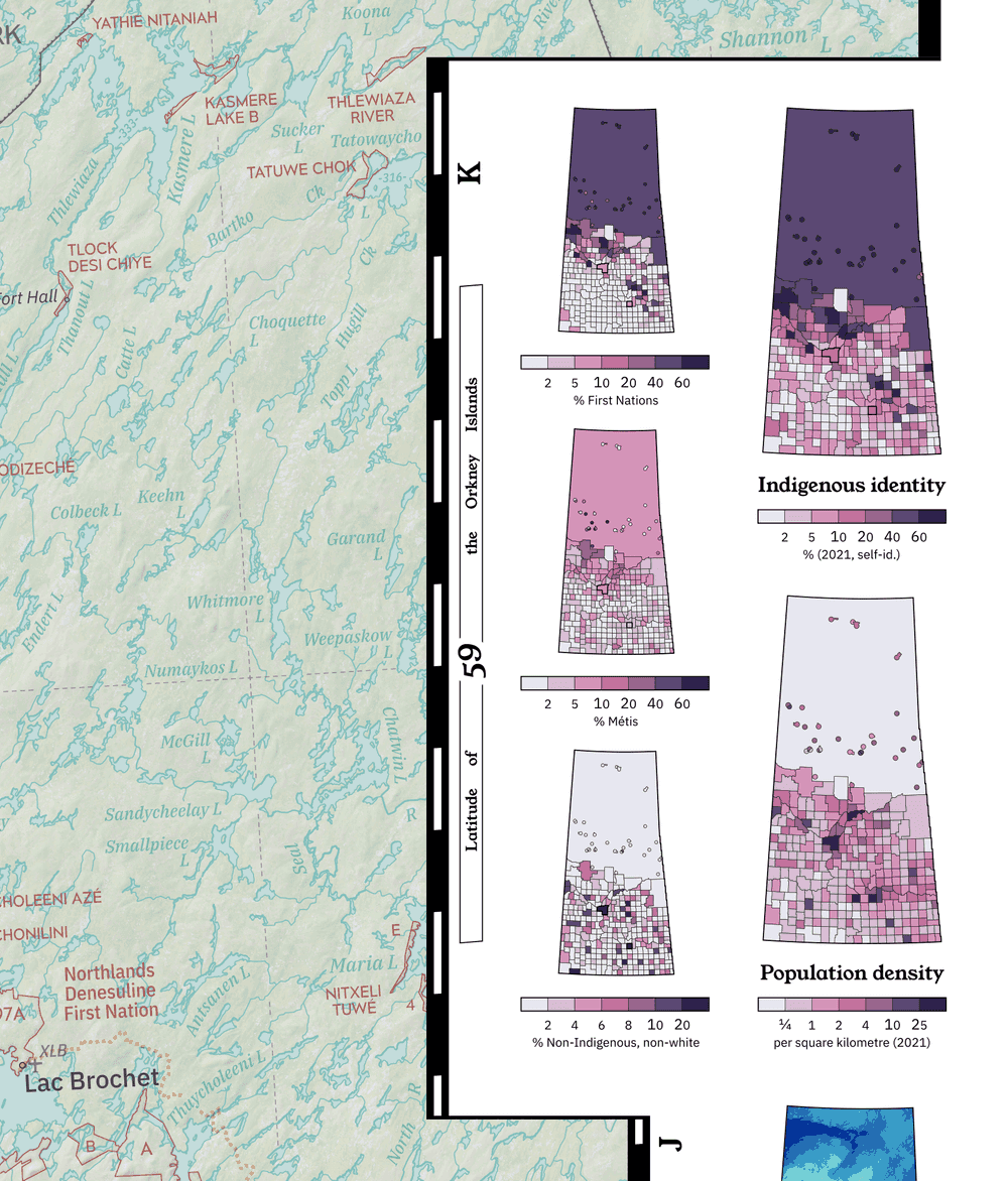
At this point, we really have exhaustively picked apart every single assumption that went into the production of this little 2-inch population density map. It's ready to be slotted into its new home:
So, this is my a complete explanation of how even a small project can take an afternoon to do properly. Did I make it all sound like a lot of work? As you might notice by browsing through my portfolio, a lot of effort gets saved after I do something once: it's easy to settle into a limited set of favourite typefaces, colour schemes, and design approaches. Writing this was a fun exercise to see if each one of my ingrained habits really can be made to sound like defensible choices!
I was also surprised how many times I needed to cite "general knowledge of life in Saskatchewan" as a source that directly led to me making particular design decisions. I still feel like I'll never fully understand this province, but at least I can convincingly talk my way through the gaps!
If I have something encouraging to say here at the end, the design fundamentals described in this post have changed surprisingly little with the digital revolution. Meanwhile, all of the tedious software-oriented grunt work that I DIDN'T mention (joining files, data entry, automatically colouring 300 individual map polygons) is either fully automatic, or easier today than it ever has been. So if you are a novice GIS user, the balance of interesting creative decisions to brainless software operation is at a historic peak. What are you waiting for?
